.svg)


Quick Answer
Heat map tools transform complex user behavior data into visual, color-coded representations that reveal exactly where users click, scroll, and engage on websites. These powerful analytics solutions help businesses optimize user experience, increase conversion rates, and make data-driven design decisions. From free options like Microsoft Clarity to enterprise solutions like Contentsquare, the right heat map tool depends on your specific needs, budget, and technical requirements.
Why Do Heat Map Tools Matter in Today's Digital Landscape?
In the digital age, visualizing complex data simply and effectively is essential. People don't want to read tiny data bits and imagine what those numbers depict. By 2026, everyone expects visual data consumption thanks to reels and short-form content trends. Visual information is now the preferred way to go.
How Do Heat Map Tools Transform Data Analysis?
This is where heat map tools play a crucial role. These powerful software solutions revolutionize how we understand and interpret user behavior patterns. Each heat map software transforms raw analytics into rich, color-coded visualizations with unique flair.
Who Benefits Most from Heat Map Generators?
Heat map generators serve diverse professionals with actionable insights. Marketers use them to understand customer hotspots on new landing pages. UX designers leverage them to enhance user journeys on apps. These tools offer insights that are both deep and immediately actionable.
What Makes Heat Map Creators So Powerful?
The beauty of heat map creators lies in their simplicity. They boil down vast data arrays into single, comprehensible images. These visualizations highlight areas of interest and concern effectively. Whether you're a seasoned analyst or budding webmaster, heat map tools offer essential versatility.
What Can You Expect from These 23 Heat Map Tools?
Each of the 23 heat map tools caters to various specific needs. Some provide real-time user engagement snapshots. Others track behavioral changes over time. These tools aren't just about attractive visualizations—they unlock the stories your data tells. We'll explore which heat map software stands out for features, ease of use, and impact on data-driven decision-making.
What Exactly Are Heat Map Tools?
Heat map tools are software designed to visually represent data through color-coded matrices. As the name suggests, they show areas of "heat" or activity. These generators convert numerical data into intuitive visualizations. Different colors represent various values or intensities. This approach makes complex datasets easier to understand and analyze quickly.
How Do Heat Maps Function as Data Visualization?
A heat map is a two-dimensional graphical representation of data. Individual values in a matrix appear as colors. Heat map tools use color gradients to indicate data variations. Brighter shades typically represent higher values. This method helps summarize and visualize complex datasets efficiently. The visual format reveals relationships between variables plotted on axes.
Why Are Heat Maps Essential for Web Analytics?
Heat map tools revolutionize web analytics by analyzing user behavior patterns. They reveal which website parts get the most interaction. Areas with highest clicks become visible immediately. Sections where users pause or stop scrolling are highlighted. Before heat maps, analyzing behavior required surveys or user reviews. Now, these tools provide invaluable navigation insights.
What Are the Main Types of Heat Maps?
Clickmaps track which website elements users click most. They display hotspots for popular clicks and cooler areas for less activity. This helps identify whether users engage with intended features like CTAs.
Scrollmaps show how far down pages users scroll. They reveal if crucial content is being seen or missed. This proves particularly useful for optimizing content placement.
Conversion Rate Heat Maps highlight elements contributing to higher conversion rates. Businesses understand which website aspects effectively drive user action.
Hovermaps track where mouse hovers on pages. They provide insights into user interest areas even without clicks. However, use hovermaps cautiously as accuracy varies.
What Key Benefits Do Heat Map Tools Provide?
Heat map tools visualize user behavior and identify hidden patterns. They unveil UX issues like overlooked content or features. These tools provide empirical evidence to guide optimizations and A/B testing. The visual nature facilitates easier stakeholder communication. This makes them valuable assets in UX and feature redesign processes.
Why Should You Use Heat Map Tools for Website Optimization?
Heat map tools are essential for several compelling reasons. They transform complex user interaction data into understandable insights. Website owners make informed decisions about design changes. Enhanced user engagement and experience result from data-driven modifications.
How Do Heat Maps Enhance Conversion Rates?
Heat map tools prove crucial for conversion rate optimization (CRO). They show if visitors click where you want them to. Areas like CTAs or navigation links become clearly visible. Analyzing heat map data helps optimize element placement strategically. This increases user interaction and conversion rates significantly.
What UX Issues Can Heat Maps Identify?
Heat maps highlight content that users overlook or find confusing. They determine the most effective placement for content and features. Scroll maps show how far users scroll on pages. This indicates if crucial content gets missed. Information becomes vital for optimizing content layout effectively.
How Do Heat Maps Guide A/B Testing Decisions?
Heat map insights prove invaluable for A/B testing and redesign efforts. They provide concrete evidence of what works and doesn't work. Data drives redesign efforts based on user behavior rather than assumptions. Heat maps help communicate insights effectively to stakeholders. This makes obtaining approval for necessary changes easier.
What Essential Features Should Heat Map Tools Include?
Intuitive User Interface: Well-designed heat map creators allow easy generation and interpretation. No steep learning curve should be required. Customization options for colors and view types prove essential.
Real-Time Data Tracking: Top-tier software shows immediate user interactions. This offers instant insights into current user behavior patterns.
Advanced Analytics: Multi-faceted tracking includes clicks, mouse movements, and scroll depth. This comprehensive approach ensures complete user engagement understanding.
Device Compatibility: Responsive heat maps work across all devices from desktops to smartphones. Mobile traffic continues increasing, making this feature crucial.
Privacy Compliance: Selected generators must adhere to privacy laws and standards. This becomes especially important when handling sensitive user data. Here's your optimized Section 3:
What Are the Top Heat Map Tools Worth Considering?
Let's explore the leading heat map tools that stand out in today's market. Each offers unique strengths for different business needs. From comprehensive debugging solutions to user-friendly interfaces, these tools transform user behavior analysis. We'll examine their key features, pricing structures, and real-world applications.
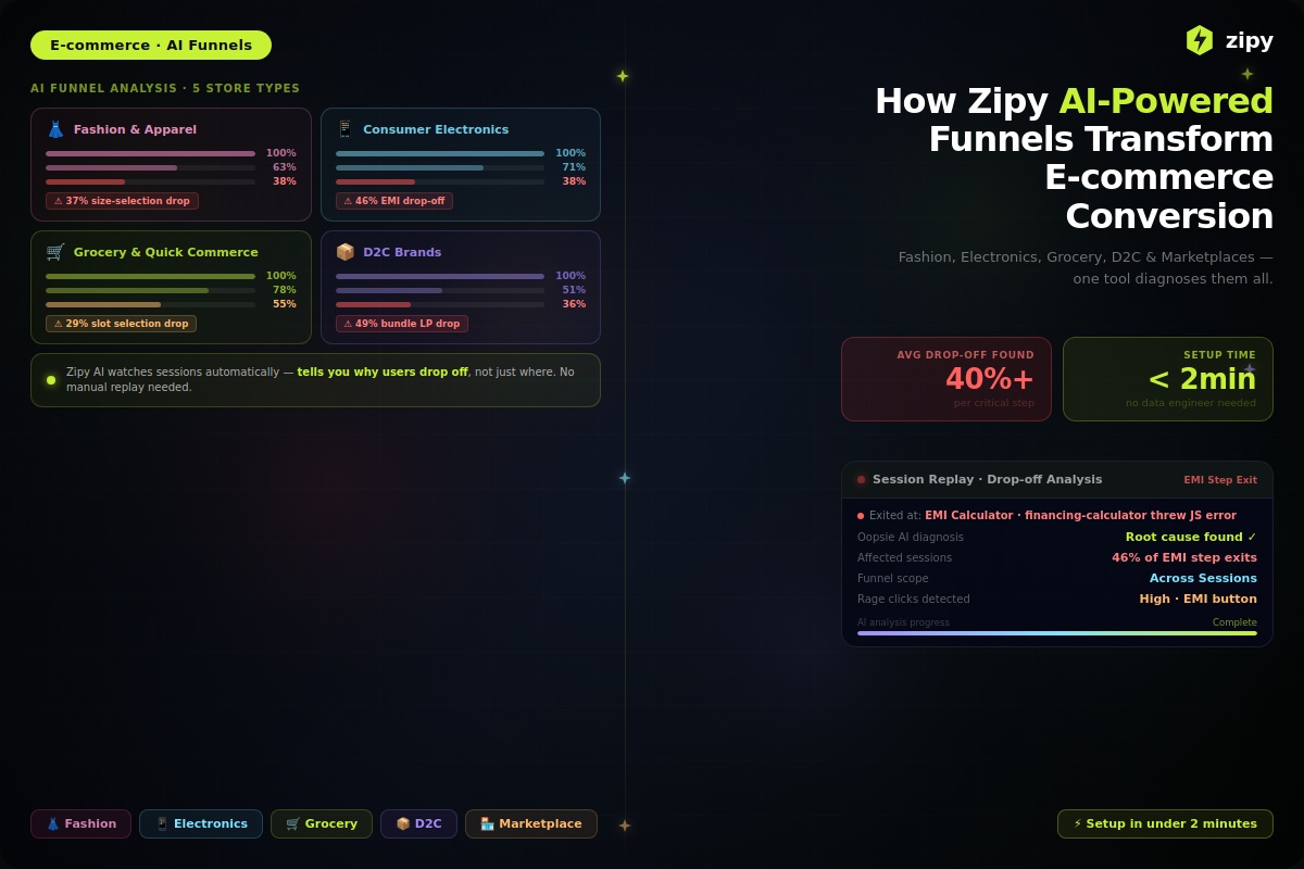
Why Is Zipy.ai More Than Just a Heat Map Tool?
Zipy.ai emerges as a multifaceted solution in the digital landscape. This heat map software seamlessly blends visualization proficiency with powerful debugging features. It's crafted for users who want to visualize engagement and dive deeper into user experience issues.

Best for: Teams needing combined heat mapping and debugging capabilities
Key Strengths:
- Efficient Heat Map Generator: Real-time user session replay acts as dynamic heat map creator
- Comprehensive Debugging: Advanced dev tools, stack trace analysis, console and network logs included
- Enhanced User Experience: Provides invaluable insights that help refine digital experiences
- User Session Replay: Perfect for both aggregate quantitative analysis and qualitative deep dives
Customer Testimonial: "We integrated Zipy early on and it's now part of our daily scrums - my team has a constant eye on Production bugs. Zipy improves our Productivity significantly." - Manish Mishra, Co-founder & CTO, PAZCARE
- Free Tier: Up to 1,000 user sessions monthly
- Paid Plan: $39/month for 7,500 sessions (includes heat maps, error monitoring, user segmentation)
- Enterprise Plan: Tailored solutions available
How Does Plerdy Excel in Website Analysis?
Plerdy Website Heat Map Tool emerges as paramount heat map software for meticulous website analysis. This comprehensive suite enhances website performance with remarkable accuracy. The user-friendly interface makes it accessible to businesses of all sizes.
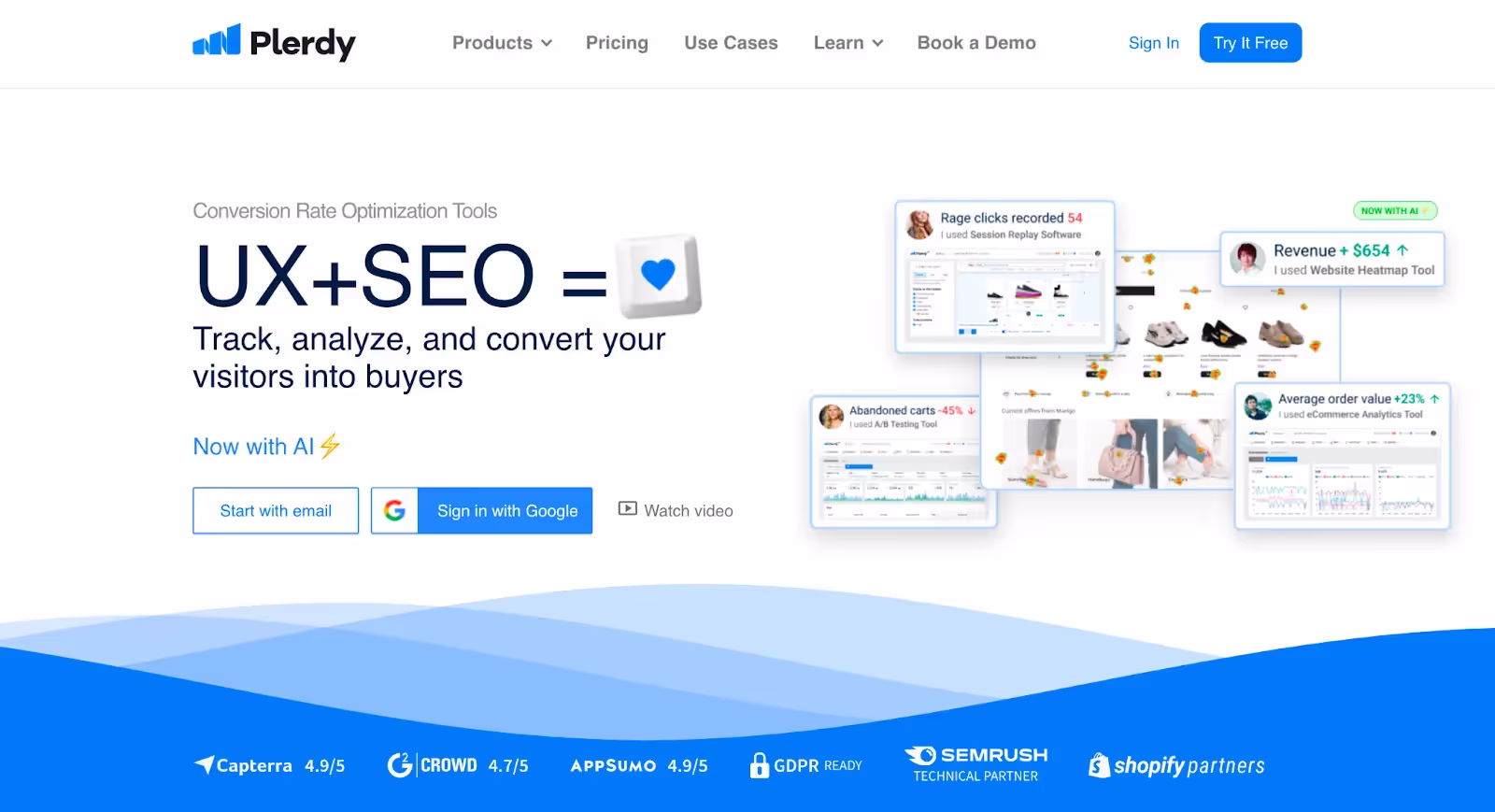
Best for: Businesses requiring precise user interaction tracking across multiple platforms
Advantages:
- Accurate User Interaction Tracking: Excels in precisely recording clicks and navigation without sampling
- Real-Time Data: Instantly track user behavior for quick optimization insights
- Versatile Platform Compatibility: Seamlessly adapts to WordPress, Shopify, and various website types
- Comprehensive CRO Features: Includes smart form builders and dynamic banners for conversion optimization
Potential Drawbacks:
- Integration Hiccups: Some compatibility issues reported with certain platforms
Pricing Options:
- Start Free: Access core heat map tools at no cost
- Scalable Plan: $98/month for expanding needs and larger data volumes
What Makes Hotjar a Revolutionary Heat Map Solution?
Hotjar stands out as a premier heat map generator offering detailed website interaction insights. This revolutionary player provides a multifaceted analytics suite designed for user experience research. Companies optimize websites based on solid data, improving performance and satisfaction.

Best for: Comprehensive user behavior analysis across all devices
Key Benefits:
- Extensive Heat Map Coverage: Visual representation of clicks and scrolls for precise enhancements
- Flexible Creation Tools: Tracks clicks, mouse movements, and scrolling comprehensively
- Insights into User Behavior: Includes rage click maps highlighting frustration areas
- Cross-Device Compatibility: Analyzes behavior across desktops, tablets, and smartphones effectively
- Accessible Free Version: Robust free tier available for businesses of any size
Considerations:
- Learning Curve: Wide feature range can overwhelm beginners initially
- Session Limitations: Free and basic plans limit daily user sessions
Pricing Structure:
- Free Version: Basic heat map tools with daily session allowances
- Hotjar Observe: €32/month for additional sessions and features
- Business Plans: From €80/month with funnel and trend analysis
Why Choose Lucky Orange for Comprehensive User Journey Analysis?
Lucky Orange emerges as multifaceted heat map software in competitive user behavior analysis markets. This tool proves instrumental for businesses seeking to understand visitor interactions. Visual representation of clicks, scrolls, and navigation patterns provides complete insights.
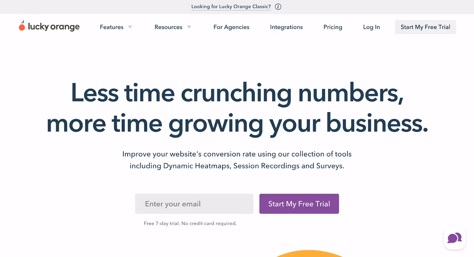
Best for: Businesses requiring detailed user path analysis with real-time tracking
Strengths:
- Comprehensive User Journeys: Records complete user paths from start to finish
- Real-Time Tracking: Live user tracking with instantly refreshable data
- Advanced Segmentation: Overlay metrics like user source, device, and browser
Limitations:
- Interface Complexity: Multi-stepped process for aggregating specific page data
- Heat Map Accessibility: Requires direct page input without quick links
- Site Compatibility: Code snippet may conflict with security settings occasionally
Pricing Plans:
- Basic Plan: Free forever with automatic data capture and unlimited heat maps
- Build Plan: $32/month with filtering, segmentation, and Events API
- Grow Plan: $64/month with custom integrations and Identify API
- Scale Plan: $600/month with full features, funnels, and dedicated support
How Does Quantum Metric Provide Advanced Behavioral Insights?
Quantum Metric emerges as robust heat map software offering deep user experience insights. This platform delves beyond simple click tracking to understand user action motivations. In-depth behavioral analysis provides comprehensive understanding of website interactions.
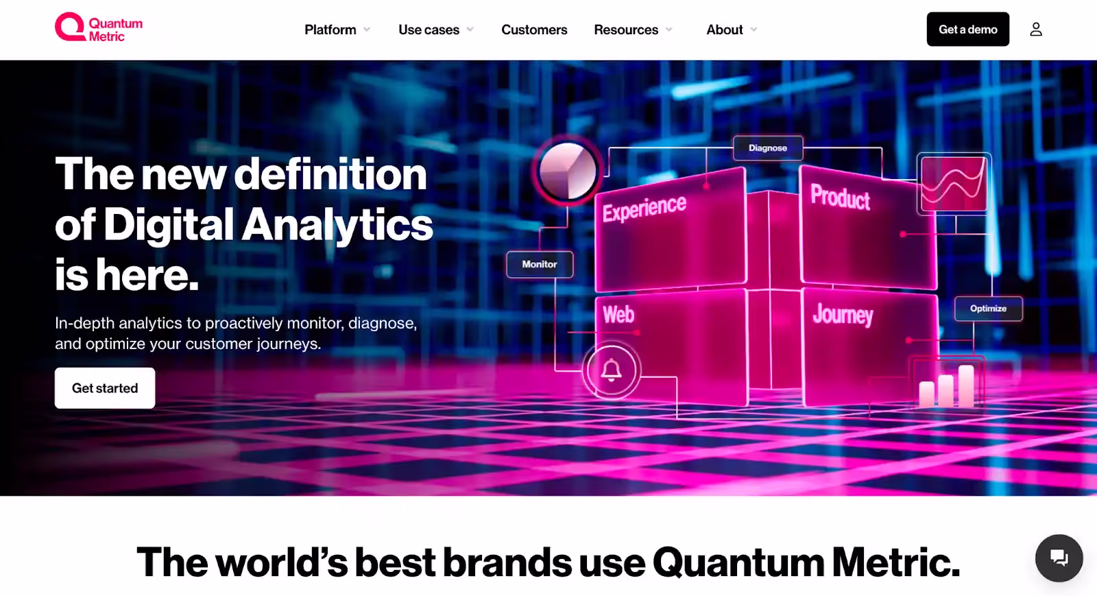
Best for: Enterprise-level businesses requiring advanced behavioral analysis without budget constraints
Advantages:
- Immediate Data Feedback: Real-time analysis shows interactions as they happen
- User-Friendly Design: Intuitive interface accessible to all skill levels
- Advanced Behavioral Insights: Nuanced look at user behavior clarifying action reasons
Disadvantages:
- No Free Version: No trial or freemium plan available
- Cost Considerations: Expensive platform requiring significant commitment
Investment Requirements:
- No Setup Fee: Platform costs vary by requirements
- Premium Services: Consulting and integration services available
- Custom Pricing: Contact website for detailed pricing information
What Advanced Capabilities Does Acoustic Analytics Offer?
Acoustic Analytics distinguishes itself in the digital analytics realm through sophisticated heat map tools. This platform excels in providing detailed insights into user website interactions. Heat map technology transforms complex data into easily understandable visual formats. Businesses gain clear insights into user experiences through advanced visualization capabilities.
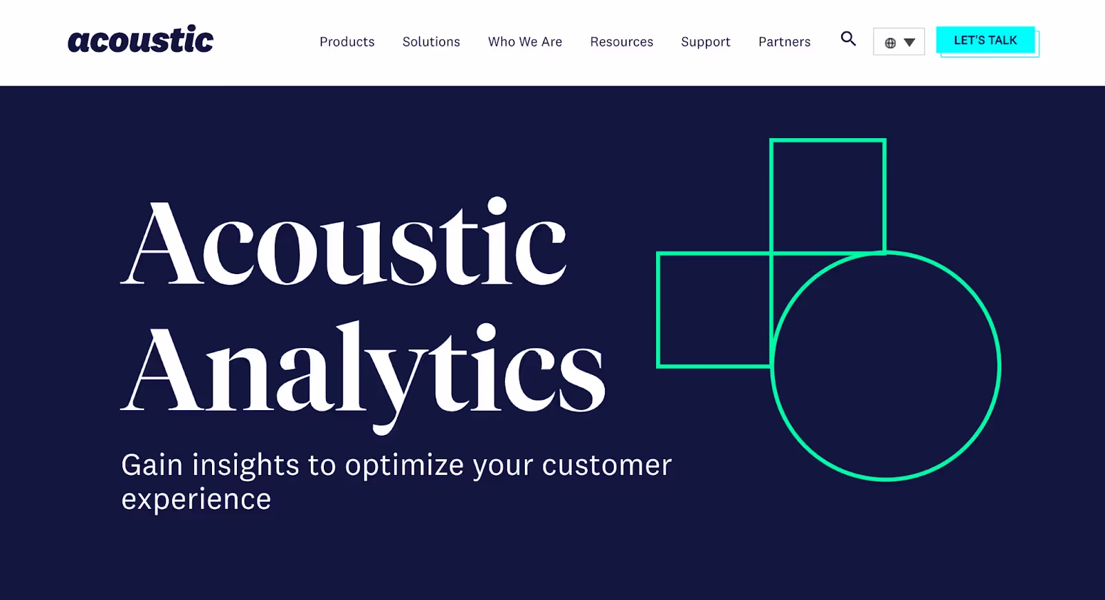
Best for: Businesses requiring sophisticated data visualization with seamless infrastructure integration
Key Advantages:
- Advanced Visualization: Converts complex data into straightforward, easily interpretable visual formats
- Seamless Integration: Smoothly integrates with existing web infrastructures for immediate insights
- Customizable Heat Maps: Users adjust heat maps to suit specific analytical requirements
Considerations:
- Complex Interface: Robust platform requires learning period for effective navigation
- Advanced Features: Some features may challenge users without sufficient training
Investment Structure:
- Flexible Pricing: Custom pricing model through direct sales contact
- Scalable Solutions: Costs align with expected utility and business scale
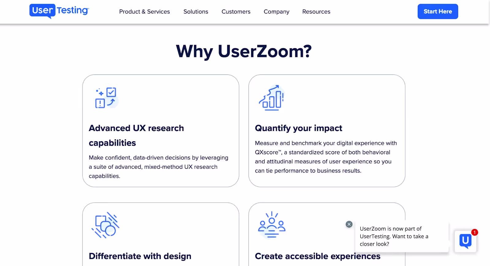
How Does UserZoom Excel in UX Research Integration?
UserZoom offers robust heat map tools as part of comprehensive user experience insights systems. This platform provides qualitative, quantitative, and mixed-method approaches for digital platform analysis. Advanced heat map technology clearly shows user clicking patterns. Interface optimization becomes straightforward through detailed behavioral analysis.
Best for: UX researchers requiring comprehensive mixed-method analysis capabilities
Strengths:
- Efficient Heat Map Generation: Streamlined process transforms click data into clear visual representations
- Accurate Behavioral Data: Captures detailed interactions with high precision recording
- Non-Intrusive Collection: JavaScript tags avoid cumbersome downloads for extensive research projects
- Versatile Research Support: Supports click testing, task-based studies, and diverse UX techniques
Limitations:
- Outdated Interface: Less intuitive design complicates learning process for new users
- Limited Reporting: No significance testing; customization challenges may require additional tools
- Study Design Rigidity: Linear designs work well; complex non-linear studies face limitations
Pricing Approach:
- Tailored Pricing: Custom plans from small businesses to large enterprises
- Cost Considerations: Platform can be expensive without frequent utilization
- Direct Contact: Customized pricing plans discussed individually
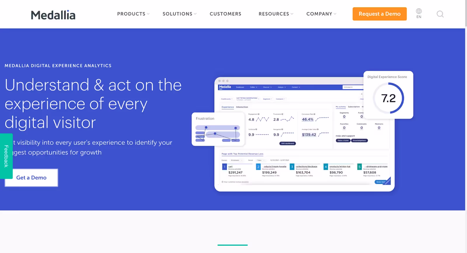
Why Choose Decibel for Digital Experience Scoring?
Decibel, part of Medallia Digital Experience Analytics, delivers sophisticated heat map tools for deep digital insights. This complete system scores every digital customer experience comprehensively. The platform aims to improve digital presence and customer relationships significantly. It's more than a heat map generator—it's a strategic experience platform.
Best for: Growth-focused businesses requiring real-time customer engagement and revenue optimization
Notable Advantages:
- Advanced Visualization: Sophisticated capabilities convert interaction data into clear visual insights
- Comprehensive Behavior Tracking: Session replays and journey analytics reveal the 'why' behind behaviors
- Revenue Growth Insights: Identifies top pages impacting revenue for strategic optimization
- Real-Time Engagement: Enables immediate customer interaction based on digital behaviors
Areas for Improvement:
- Interface Navigation: Some users find searching for specific analytics features challenging
- Segmentation Syncing: Lengthy sync times between analytics platforms need optimization
- Dashboard Relevance: Initial dashboard may lack relevance without customization
Pricing Information:
- Competitive Starting Point: Accessible pricing for heat map tool integration
- Custom Consultation: Contact sales team for detailed pricing and product demos
What Makes Hitsteps Web Analytics Unique for Real-Time Tracking?
Hitsteps Web Analytics offers comprehensive heat map tools with real-time visitor management capabilities. This platform includes live chat features beyond traditional heat mapping. Deep dives into visitor behavior across devices become possible. The Page Analysis feature pinpoints exactly what users find engaging on pages.

Best for: Businesses requiring real-time visitor tracking with comprehensive device analysis
Key Benefits:
- Real-Time Interaction Tracking: Follows user paths immediately for instant behavioral insights
- Comprehensive Visitor Insights: Detailed data includes geolocation, device information, and visit details
- Innovative Heat Map Visualization: Page Analysis offers next-generation click engagement views
Potential Drawbacks:
- Interface Design: Less intuitive compared to other heat map tools
- Data Visualization Limits: Not as advanced as some competitors for in-depth analysis
Pricing Structure:
- Free Plan: Basic use starting tier available
- Starter Pack: $4.99/month for small-scale needs
- Ultimate Plan: $49.99/month for large-scale requirements
- Scalable Options: Varying page views, data retention, and heat map clicks included
Which Heat Map Tool Should You Consider for Your Business?
Each tool serves different business needs and budget requirements. Acoustic Analytics excels in sophisticated visualization for enterprise needs. UserZoom provides comprehensive UX research capabilities for detailed analysis. Decibel focuses on revenue optimization through digital experience scoring. Hitsteps offers real-time tracking at competitive price points.
Consider your specific requirements: integration complexity, research depth, real-time needs, and budget constraints. These factors determine which heat map software best serves your optimization goals.
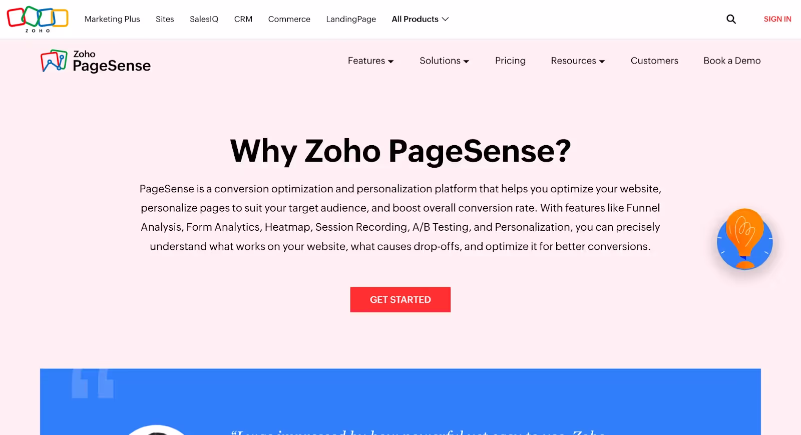
How Does Zoho PageSense Enhance Conversion Optimization?
Zoho PageSense emerges as a key player in heat map tools domain. This suite enhances user engagement and conversion rates through detailed visitor behavior insights. Capabilities include attention maps, scroll maps, and variation-specific heat maps for A/B testing. Visual visitor interaction maps optimize website experiences effectively.
Best for: Businesses seeking user-friendly conversion optimization with comprehensive A/B testing capabilities
Key Advantages:
- Intuitive User Experience: Drag-and-drop interface makes it accessible for users avoiding coding complexity
- Robust Data Customization: Users customize reports, filter data, and collaborate easily through versatile dashboards
- Seamless Integration: Straightforward implementation requires only HTML code addition for web optimization
- Comprehensive Analytical Suite: Offers A/B testing and personalization for full-service website management
Considerations:
- Interface Limitations: Some users find clarity lacking when correlating clicks to elements
- Customer Service Gaps: Support can sometimes be delayed despite user-friendly systems
- Event Recording Delays: Dashboard reflections and heat map playback may experience delays
Pricing Structure:
- Analyze Plan: Essential features including heat maps and session recording
- Optimize Plan: Advanced options with A/B testing and personalization
- Enterprise Solutions: Custom pricing for businesses exceeding one million visitors
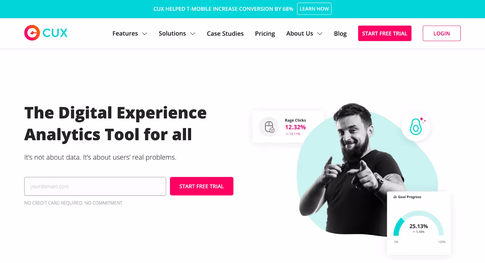
What Makes Cux.io Stand Out for Multi-Device Analysis?
Cux.io represents innovative heat map technology designed for visualizing user engagement across various platforms. From mobile devices to smart TVs, this platform offers comprehensive coverage. Versatile heat map filters segment data by different user behaviors. The unique grouping function enables user segment comparisons effectively.
Best for: UX managers requiring comprehensive multi-device user behavior analysis
Strengths:
- Intuitive Heat Map Creation: Analyzes click patterns, identifies broken links, and discovers user frustration areas
- Versatile User Analysis: Tracks behavior across various devices for comprehensive user experience insights
- Customer-Centric Insights: Enables digital marketers to pinpoint missed conversion opportunities and understand customer journeys
Limitations:
- Integration Complexity: Process could be more user-friendly for non-technical users
- Limited Third-Party Integrations: Compatibility improvements needed with tools like Intercom
- Non-Disclosed Pricing: Lack of transparent website pricing requires direct inquiry
Investment Options:
- Business Plan: €79 (approximately $84 USD) for advanced analytics capabilities
- Enterprise Plan: Custom features and dedicated support through direct sales consultation
- Personalized Quotes: Recommended for determining best company fit
Why Choose Browsee for Advanced Error Monitoring?
Browsee distinguishes itself by translating complex mouse activity data into color-coded visual representations. This heat map creator offers comprehensive tools including click maps, scroll maps, and attention maps. Each provides unique insights into user engagement and website behavior patterns.
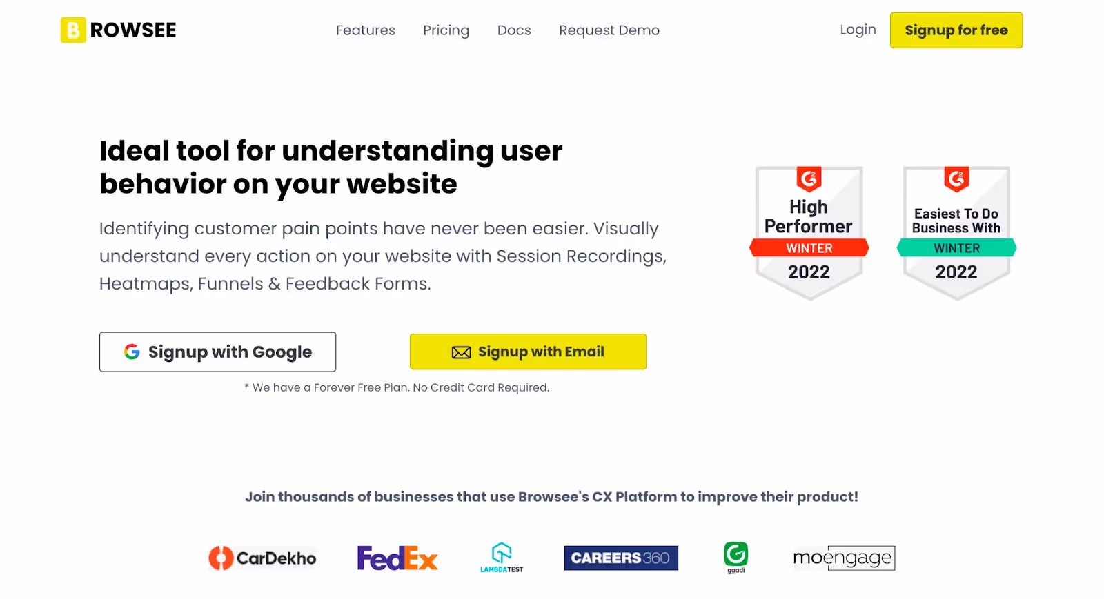
Best for: High-growth companies requiring advanced error monitoring with robust tagging systems
Notable Benefits:
- Robust Tagging System: Innovative frustration, U-turn, and input field confusion indicators provide clear user challenge insights
- Seamless Integration: Hassle-free pixel placement enables immediate tracking and enhanced capabilities
- Advanced Attention Maps: Restructured page layouts boost user engagement beyond traditional heat mapping
- Comprehensive Error Monitoring: Accurate JavaScript error capture improves QA processes and website functionality
Areas for Enhancement:
- Reporting Integration: Needs improved integration with tools like Google Analytics for unified overviews
- Geographic Segmentation: More refined segmentation options needed for excluding specific geographies
Pricing Tiers:
- Plus Plan: $46/month with 800,000 page views and 10,000 recordings monthly
- Pro Plan: $103/month for 1,000,000 page views and 30,000 recordings monthly
- Executive Plan: $239/month offering 2,000,000 page views and 100,000 recordings monthly
What Are Microsoft Clarity's Unique Cost Advantages?
Microsoft Clarity stands out as part of Microsoft's analytics suite offering comprehensive heat map capabilities. Click, scroll, and attention heat maps visualize user behavior effectively. This platform provides clear pictures of what attracts attention and what doesn't. Insights help optimize user website interactions comprehensively.
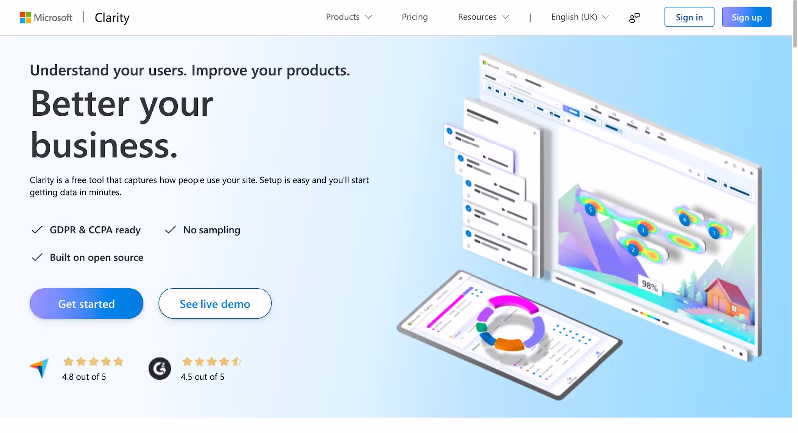
Best for: Budget-conscious businesses requiring robust analytics without financial barriers
Key Benefits:
- Free Access: Cost-effective service without traffic limits or upgrade requirements
- Easy Integration: Seamlessly combines with Google Analytics for enhanced heat map utility
- Compliance Support: GDPR compliance with responsive troubleshooting support ensures reliable analysis
- Innovative UX Metrics: Unique rage clicks and dead clicks metrics enable comprehensive UX optimization
Considerations:
- Documentation Gaps: Limited detailed documentation for Google Analytics integration
- Filter Functionality: Missing 'exclude' feature complicates nuanced data segmentation processes
- Login Issues: Shared logins can create access confusion for team members
Pricing Model:
- Completely Free: No financial barriers for businesses of all scales
- No Traffic Limits: Unlimited usage without upgrade pressures
Note: Consider data privacy implications when using free analytics tools for customer information.
How Does Mouseflow Serve Over 210,000 Clients Effectively?
Mouseflow represents cutting-edge heat map technology serving diverse industries globally. This platform specializes in creating detailed heat maps offering comprehensive user behavior insights. Automatic heat map generation covers all pages and visitors immediately. User click, scroll, and interaction patterns become clearly visible.

Best for: Businesses requiring automatic heat map generation with extensive integration capabilities
Primary Advantages:
- Intuitive Heat Map Generation: Easy setup enables straightforward heat map creation without steep learning curves
- Seamless Data Slicing: Extensive filtering options provide tailored heat map insights efficiently
- Responsive Customer Support: Team noted for responsive service during sophisticated tool usage
- Robust Integration Capabilities: Compatible with most web platforms for diverse analytics applications
Potential Drawbacks:
- Limited Feedback Module: Trigger behavior issues may affect seamless user experiences
- Feature Learning Curve: New users require time familiarizing themselves with comprehensive capabilities
- Session Capture Limitations: May not capture every session, affecting complete data coverage
Pricing Structure:
- Starter Plan: $39/month with no setup fees required
- Growth Plan: $129/month for expanding business needs
- Business Plan: $259/month for comprehensive enterprise requirements
Which Tool Offers the Best Value for Your Specific Needs?
Each platform serves distinct business requirements and budget constraints. Zoho PageSense excels in conversion optimization with user-friendly interfaces. Cux.io provides comprehensive multi-device analysis capabilities. Browsee offers advanced error monitoring with robust tagging systems. Microsoft Clarity delivers free access without compromising essential features. Mouseflow serves large client bases with automatic generation capabilities.
Consider factors like budget limitations, technical expertise requirements, integration needs, and specific analytical goals when selecting your optimal heat map solution.
How Does FullStory Capture User Interactions Through Vibrant Visual Data?
FullStory stands out in digital analytics by offering intuitive heat map tools. These capture and represent user interactions through vibrant visual data effectively. Understanding where users click, scroll, and engage becomes straightforward. Heat map software simplifies complex data analysis and enhances website optimization significantly.
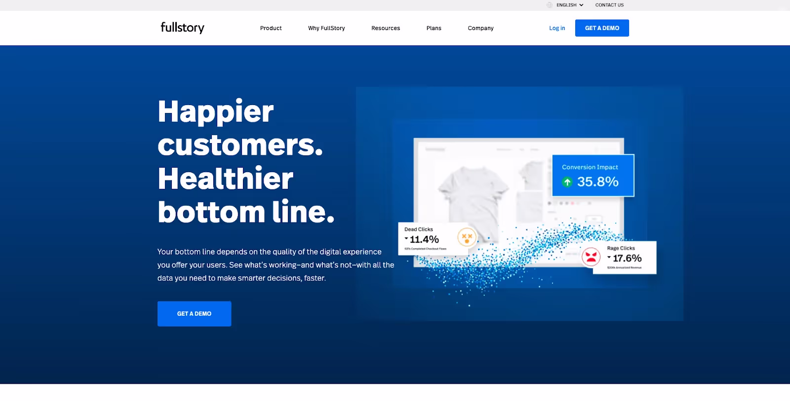
Best for: Businesses requiring comprehensive user behavior tracking with collaborative analysis capabilities
Key Strengths:
- Comprehensive User Behavior Tracking: Provides clear pictures of user movement and website interactions supporting custom event tracking
- Visual Clarity in Data: Straightforward user experience capture through decent interface and good filtering options
- Versatile UX Research: Records sessions and allows team member sharing for collaborative analysis and decision-making
Considerations:
- Managing Data Overages: Contract-based agreement overages can be challenging to manage cost-effectively
- Interface Usability: Session breakdown and result views could be more intuitive for all users
Investment Information:
- Custom Pricing: Contact provider directly for detailed pricing information
- Budget Alternatives: Consider exploring FullStory alternatives for comprehensive low-budget solutions
What Makes LiveSession a Dynamic User-Friendly Solution?
LiveSession emerges as dynamic and user-friendly heat map technology designed for simplifying tracking processes. Website user behavior analysis becomes accessible through powerful heat map software. The platform offers extensive features for diving deep into data and user interactions. Businesses of all sizes find this an excellent option.
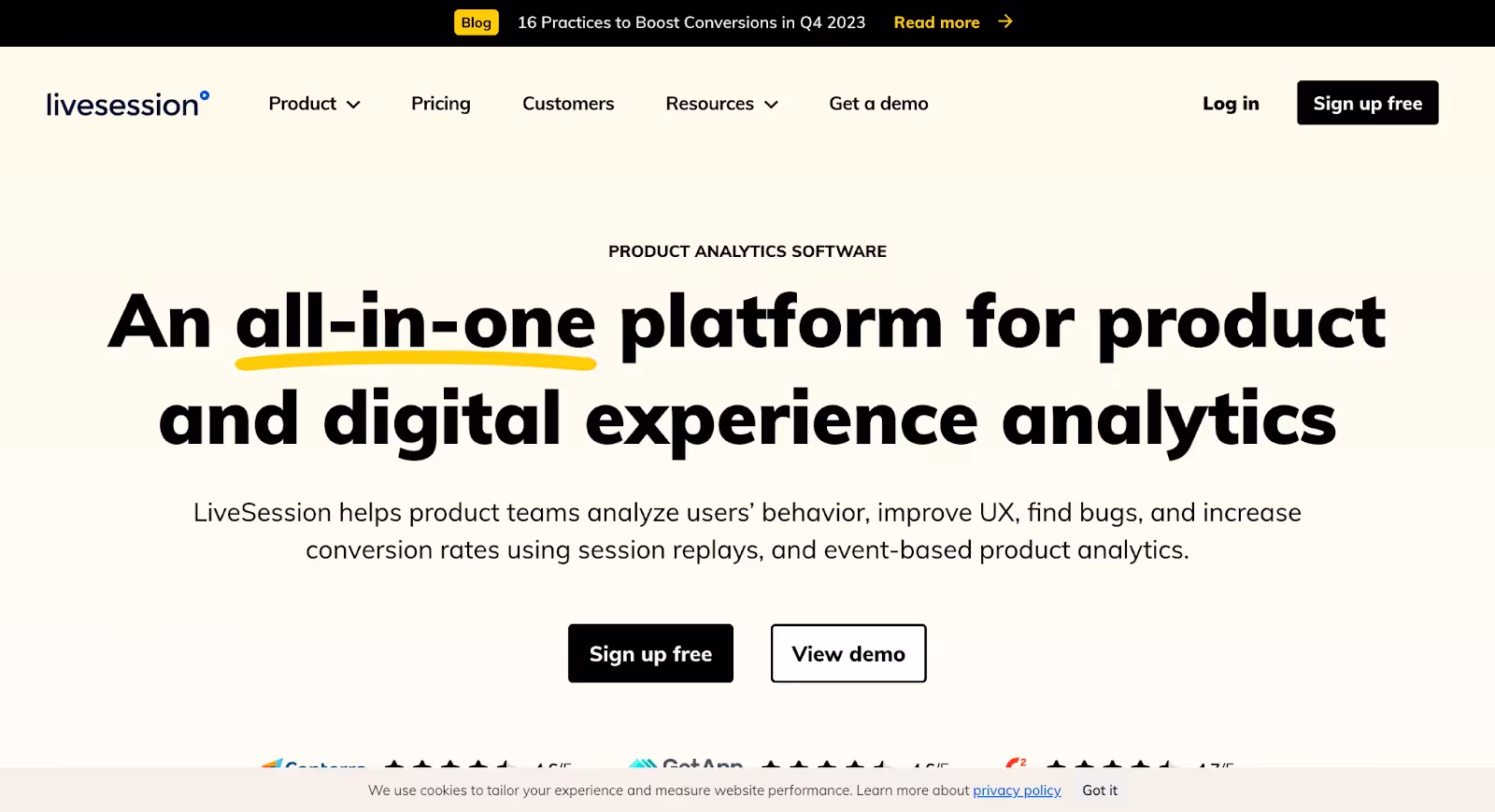
Best for: Businesses seeking user-friendly interfaces with advanced segmentation and customer-centric support
Notable Advantages:
- User-Friendly Interface: Celebrated for simplicity making it accessible even for heat map tool newcomers
- Customer-Centric Support: Team promptly addresses queries and genuinely cares for customer success outcomes
- Advanced Segmentation: Robust customer behavior analysis with advanced filtering options and custom segment creation
Areas for Development:
- Integration Opportunities: Desire for more integrations exists though progress is currently underway
- Customization Limitations: Need for more personalized panels expected to improve with upcoming REST API
- Analytical Features: Further development of analytical features like heat maps anticipated for platform growth
Trial and Pricing:
- Free 14-Day Trial: Access to all Pro plan features before commitment
- Flexible Cancellation: Subscription cancellation available anytime with major credit card payment options
- GDPR/CCPA Compliant: Privacy and data protection emphasized across multiple website usage
How Does MapBusinessOnline Streamline Business Processes?
MapBusinessOnline distinguishes itself as heat map software designed specifically for streamlining business processes. This tool excels as heat map generator and demographic mapping solution. Market analysis capabilities extend beyond traditional heat mapping functions. Business optimization becomes achievable through comprehensive data handling.
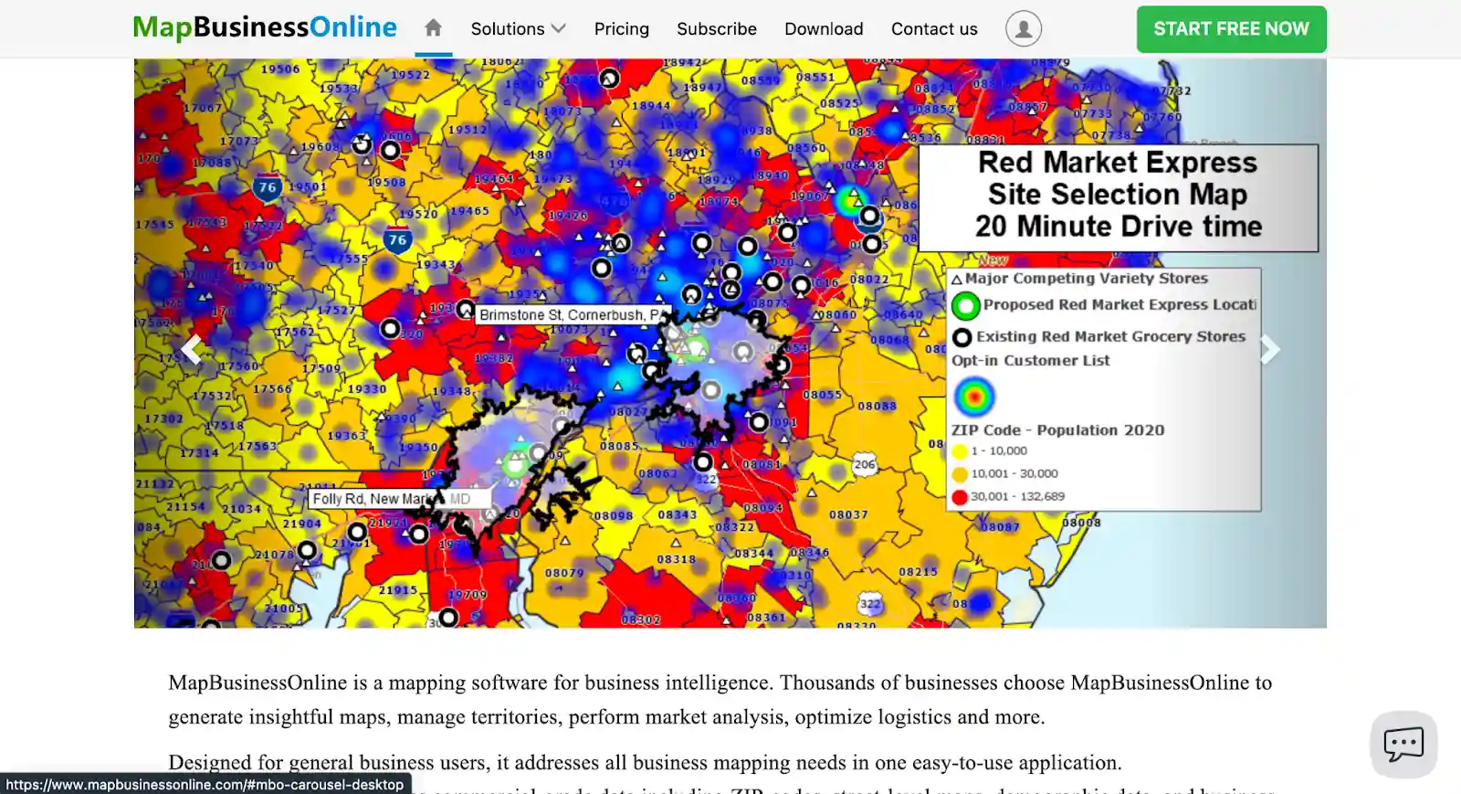
Best for: Businesses requiring demographic mapping with advanced data handling for market analysis
Primary Benefits:
- User-Friendly Software: Straightforward and easy-to-use once acquainted with praised customer support
- Robust Data Handling: Imports up to 250,000 records per map with advanced drive time analysis features
- Customizable Mapping: Easy data loading with various mapping options and customizable icon capabilities
Limitations:
- Printing Constraints: Function prints individual state map views quite small without data set additions
- Navigation Challenges: Map navigation less intuitive posing learning curves for complex tasks
Pricing Structure:
- Edition Range: Three pricing editions from $500 to $2,375 available
- Pro Version: $900.00/year including USA base map data
- Free Trial: Available for testing software before commitment
Why Choose Freshmarketer for Comprehensive Shopping Behavior Analysis?
Freshmarketer gains recognition for comprehensive tool suites including renowned heat map generator capabilities. Businesses scrutinize user behavior and enhance user experiences effectively. Shopping behavior analysis becomes accessible through valuable heat map tools. User engagement insights drive optimization decisions.
Best for: E-commerce businesses requiring all-in-one functionality with comprehensive A/B testing insights
Key Advantages:
- User-Friendly Interface: Easy-to-use interface valuable for analyzing shopping behavior and user engagement patterns
- All-In-One Functionality: Combines multiple apps keeping workflows clean and efficient with impactful testing insights
- Comprehensive Support: Customer service team highlighted as helpful and knowledgeable for capability maximization
Considerations:
- Developmental Bugs: Constantly evolving software may encounter bugs though resolution happens promptly
- Performance Issues: Occasional speed and responsiveness concerns due to JavaScript-based implementation
- Pricing Considerations: Costs might be steep for smaller organizations despite justifiable insights
Pricing Options:
- Free Plan: Basic features available without cost
- Paid Plans: Starting at approximately $19/month for various business sizes
- Current Pricing: Check official website or contact sales team for most accurate information
What Privacy Advantages Does Matomo Offer as Open-Source Software?
Matomo distinguishes itself as a comprehensive open-source heat map generator with extensive website analysis features. User privacy and data control emphasis makes it appealing to businesses concerned with data protection. Self-hosted nature provides full control over data and privacy management. Advanced analytics platform features come standard.

Best for: Privacy-conscious businesses requiring open-source flexibility with extensive customization capabilities
Significant Benefits:
- Open Source Flexibility: Self-hosted nature simplifies setup and management with full data control
- Rich Feature Set: Extensive tracking and analyzing capabilities with unparalleled customization options
- Cost-Effective: Quality alternative with excellent cost-benefit ratio especially for intranet content systems
Potential Drawbacks:
- Premium Costs: Some premium features come at significant cost beyond free open-source version
- Complex Interface: New users might find interface and settings daunting with steeper learning curves
- Data Accessibility: Most accessed pages display prominently making less frequented page data challenging to find
Pricing Model:
- Free Option: Open-source On-Premise version available without cost
- Cloud Version: Free 30-day trial with plans starting at $9/month for essential features
- Traffic Limits: Monthly traffic restrictions apply with optional setup fees
How Does Contentsquare Set High Standards for Actionable Insights?
Contentsquare sets high standards in heat map tools realm through robust software capabilities. User behavior understanding on websites becomes enhanced significantly. This heat map generator focuses on translating data into actionable insights. Customer-centric product decisions become driven by comprehensive analysis.
Best for: Enterprise businesses requiring extensive training and comprehensive data insights for critical decisions
Exceptional Features:
- Invaluable Heat Maps: Pivotal visualization of user engagement providing deep dives into feature interactions
- Comprehensive Training: Extensive training ensures users maximize heat map tool potential for business decisions
- Actionable Insights: Excels at presenting data in accessible visual formats for quick issue identification
Challenges:
- Learning Curve: Platform depth challenges new users initially with steep learning curves for advanced features
- Complex Journey Tracking: Functionality can be perplexing necessitating training and experience for effective navigation
Investment Approach:
- Bespoke Pricing: Details require direct engagement with sales team for personalized quotes
- Custom Solutions: Pricing aligns with specific business needs and requirements
What Free Version Benefits Does Smartlook Provide?
Smartlook emerges as powerful contender in heat map tools space providing excellent website usability improvement solutions. This heat map generator gains recognition for ease of use and interesting feature offerings. Site user experience enhancement becomes achievable through accessible functionality. Usability improvement proves considerable through effective heat map solutions.

Best for: Businesses wanting to trial free versions before committing to paid subscriptions
User-Reported Benefits:
- User-Friendly Design: Heat map tools reported as easy to use with many useful features
- Excellent Heat Map Solutions: Considerable site usability improvement facilitated through effective solutions
- Free Version Access: Ability to trial before paid subscription proves awesome feature users appreciate
Notable Limitation:
- Missing Click Data: Heat maps don't show percentage clicks meaning crucial analytical data might be missing
Which Advanced Heat Map Tool Best Serves Your Business Goals?
Each platform addresses specific business needs and technical requirements differently. FullStory excels in comprehensive behavior tracking with collaborative features. LiveSession provides user-friendly interfaces with advanced segmentation capabilities. MapBusinessOnline specializes in demographic mapping for market analysis. Freshmarketer offers all-in-one e-commerce functionality. Matomo delivers open-source privacy control. Contentsquare provides enterprise-level actionable insights. Smartlook enables free trial access before commitment.
Evaluate factors like data privacy requirements, budget constraints, technical complexity, integration needs, and specific analytical objectives when determining your optimal heat map solution.
How Do You Choose the Right Heat Map Tool for Your Business?
Selecting the right heat map tool requires careful consideration of various factors. Making an informed decision involves evaluating specific business needs systematically. Different tools excel in different areas like user interaction tracking and conversion optimization. A step-by-step approach ensures optimal tool selection for your objectives.
What Should Be Your Primary Consideration When Selecting Heat Map Tools?
Understand Your Objectives: First, clarify your specific goals clearly. Are you focusing on enhancing user experience or improving website layouts? Do you want to boost conversion rates significantly? Different heat map tools have distinct strengths in various areas. Some excel in user interaction tracking while others specialize in conversion rate optimization.
Why Does User Interface Matter in Heat Map Tool Selection?
User Interface and Ease of Use: Look for heat map tools with intuitive user interfaces. Complex or unfriendly software makes utilizing full potential difficult. Tools allowing easy generation and interpretation of heat maps prove ideal. User-friendly design reduces learning curves and increases adoption rates across teams.
What Data Tracking Capabilities Should You Prioritize?
Data Tracking and Real-Time Analysis: Real-time user behavior tracking ability proves invaluable for businesses. This feature enables immediate insights and swift action responses to user interactions. Instant data access allows for timely optimization decisions. Real-time capabilities separate leading tools from basic alternatives.
Which Heat Map Visualization Types Best Serve Your Needs?
Type of Heat Map Visualization: Different tools offer various heat map types including clickmaps, scrollmaps, and hovermaps. Choose tools providing heat map types most relevant to your specific needs. Click tracking helps understand user engagement patterns. Scroll maps reveal content consumption behavior effectively.
How Important Is Device Compatibility for Modern Businesses?
Device Compatibility: Ensure heat map tools are responsive and compatible across all devices. Significant mobile user traffic makes cross-device functionality essential. Desktop and mobile user behaviors differ substantially. Tools must capture interactions accurately regardless of device type used.
What Integration Capabilities Enhance Heat Map Tool Value?
Integration with Other Tools: Integration ability with analytics or marketing tools enhances heat map software utility significantly. This capability provides more holistic views of your data. Combined insights from multiple sources improve decision-making processes. Seamless data flow between platforms increases operational efficiency.
Why Should Privacy Compliance Be a Top Priority?
Privacy Compliance and Data Security: Growing data privacy concerns make compliance with relevant laws essential. Ensure tools comply with standards especially when handling sensitive user data. GDPR and CCPA compliance protects business from legal risks. Data security measures safeguard customer trust and business reputation.
How Do Budget Considerations Impact Heat Map Tool Selection?
Budget and Pricing Plans: Consider your budget and pricing plans offered by different heat map tools carefully. Some offer free versions with basic features for small businesses. Others provide tiered pricing for more advanced functionalities. Cost-benefit analysis ensures optimal investment returns for your business.
What Role Do Customer Support and Reviews Play?
Feedback and Support: Investigate customer support quality and community feedback for potential tools. Good support systems and positive current user reviews indicate reliable tools. Responsive customer service ensures smooth implementation and ongoing success. User testimonials provide real-world performance insights.
What Makes Heat Map Tools Essential for Digital Success?
Heat map tools prove invaluable for digital analytics and UX optimization efforts. They provide visual representations of user interactions supporting data-driven decision-making processes. Clear understanding of objectives, ease of use, compatibility, and real-time capabilities remain key selection factors. Budget considerations ensure sustainable tool adoption across organizations.
How Do You Make the Final Heat Map Tool Decision?
Choose heat map tools that enhance your ability to understand and improve user interactions. Align tool capabilities with your specific digital platform goals. The right tool helps reveal stories hidden within your data effectively. Remember that the best tool suits your particular needs while providing actionable insights for continuous improvement.
Ready to transform your user behavior analysis? Use heat maps and session replay together with Zipy. Study user behavior in detail and fix issues for better digital experiences.
More resources on heatmap
- An ultimate heatmap guide for product & marketing teams
- The best Heatmap Software for user interactions and engagement
- A step-by-step guide on how to read a heatmap
- Decoding website insights: A deep dive into heatmap analytics
- Enhance UX Design: Unveiling the power of website heatmaps
- Visualizing Engagement: Exploring eye tracking heat maps for web design
- Choosing Wisely: The best heatmap alternatives for actionable analytics
FAQ Section
What are heat map tools and how do they work?
Heat map tools are analytics software that visualize user behavior on websites through color-coded data representations. They track user interactions like clicks, scrolls, and mouse movements, then display this information using color gradients where "hot" areas (typically red/orange) show high activity and "cool" areas (blue/green) indicate low engagement. These tools work by installing tracking code on your website that captures user sessions and aggregates the data into visual heat maps. This allows businesses to see exactly how users interact with their website elements, identify problem areas, and optimize layouts for better user experience and higher conversion rates.
Which heat map tool is best for small businesses on a budget?
Microsoft Clarity stands out as the best free heat map tool for small businesses, offering unlimited tracking without usage caps or upgrade requirements. For paid options under $50/month, consider Zipy.ai ($39/month for 7,500 sessions), Hitsteps Web Analytics ($4.99-$49.99/month), or Mouseflow ($39/month starter plan). These tools provide essential features like click tracking, scroll maps, and session recordings without enterprise-level complexity. Microsoft Clarity integrates seamlessly with Google Analytics and provides GDPR compliance, making it ideal for budget-conscious businesses that still need professional-grade analytics capabilities.
How do heat maps improve website conversion rates?
Heat maps improve conversion rates by revealing user behavior patterns that indicate friction points and optimization opportunities. They show where users click most frequently, how far they scroll before leaving, and which elements attract or lose attention. This data helps businesses optimize call-to-action placement, improve navigation flow, and eliminate confusing page elements. For example, if heat maps show users aren't clicking your main CTA button, you can test different colors, positions, or text. Similarly, scroll maps reveal if important content is placed too far down the page where users don't see it, allowing you to restructure layouts for maximum impact.
What's the difference between click maps, scroll maps, and hover maps?
Click maps (clickmaps) track where users click on your website, showing the most and least clicked elements through color intensity. They help identify if users are clicking on intended interactive elements like buttons and links, or getting confused by non-clickable elements. Scroll maps (scrollmaps) reveal how far down pages users scroll before leaving, indicating content engagement levels and optimal placement for important information. Hover maps track mouse movement patterns, showing where users' cursors move even without clicking. While hover maps can indicate interest areas, they should be used cautiously as mouse movement doesn't always correlate with visual attention or actual user intent.
Do I need technical skills to implement and use heat map tools?
Most modern heat map tools require minimal technical skills for implementation and daily use. Basic setup typically involves copying and pasting a single tracking code snippet into your website's header or using simple plugin installations for platforms like WordPress. Tools like Hotjar, Microsoft Clarity, and Zoho PageSense offer user-friendly interfaces with drag-and-drop functionality and intuitive dashboards. However, advanced features like custom event tracking, API integrations, or complex segmentation may require some technical knowledge. Many providers offer comprehensive support documentation, video tutorials, and customer service to help non-technical users maximize their heat map tool effectiveness without coding expertise.


.webp)