.svg)


In the world of web development, user interfaces are a crucial aspect of any web application. To our aid, there are many UI libraries that allow us to build scalable web applications from scratch.
Material UI is a React-based UI library with many ready-made components for creating an appealing user experience. It implements Material Design principles in terms of visual and interactive design, and provides a set of pre-designed and customizable React components. These prebuilt components have rescued developers from the hassle of writing CSS rules over and over again.
Whether you're an absolute beginner or an experienced developer, Material UI is an excellent library to meet the requirements of your web application. This detailed blog will help you build a responsive web application using Material UI. We will also cover all its features and benefits of Material UI.
So, let's dive in!
What is Material UI (MUI)
Material UI is a popular front-end user interface (UI) component library for React. It has a number of ready-made components for making web apps. Material design draws inspiration from the tangible world and its various textures, taking into account their interactions with light and shadows.
MUI components are created with React and follow the "composition over inheritance" principle. This means they're designed to be combined and customized for building advanced interfaces. Each component is modular so that you can easily modify it by adding or removing features, adjusting the look and behaviour, or nesting it with other components to make responsive web designs.
Material UI has approximately 2.5 million downloads per week. Its popularity can be attributed to its ease of use, flexibility, and responsive design capabilities

Material UI is a vast library that offers a wide range of user interface elements and components. You can find everything from modals and forms to form elements and much more. These components are very flexible and can be customized to our needs, making them perfect for creating responsive and accessible React components from scratch.
Getting started with Material UI
In order to set up Material UI in your project, you need to have a working React project.
Setting up a React project
One prerequisite before creating a React app is to install Node.js on your system, as it is required to provide the necessary runtime environment for executing JavaScript code on the server or local machine.
Now you can follow the below steps:
- Open the command prompt in the folder where you want to have your React app. You can move the chosen folder location with the cd (change directory) command.
- Type the following command to create a boilerplate setup. npm init vite@latest my-react-app --template react Additionally, you can also use NextJS, which is a production-grade framework built on top of ReactJS. You can use the following command to set up a NextJS project: npx create-next-app
- Now change the working directory to your project directory using the following command. cd project-directory
- Start your development server by running npm start or npm run dev on the terminal.
Now that you have finished setting up your React project setup, let's integrate Material UI into the project.
Install Material UI
Material UI can be installed on your project using the package manager of your choice. NPM and yarn are the most popular ones.
To add Material UI to your project, run one of the following commands:
NPM - npm install @mui/material @emotion/react @emotion/styled
Yarn - yarn add @nui/material @emotion/react @emotion/styled
After installing Material UI, you can now import the UI components into your React component by using the syntax.
Now that Material UI is installed on your project, let's understand the basic UI components present in Material UI.
Understanding the basic UI components in Material UI
As we mentioned earlier, Material UI is a vast library with lots of components that we can use. All we have to do is import the component, and we can directly start using the MUI component in our React application.
Some of the most commonly used Material UI components are:
Buttons
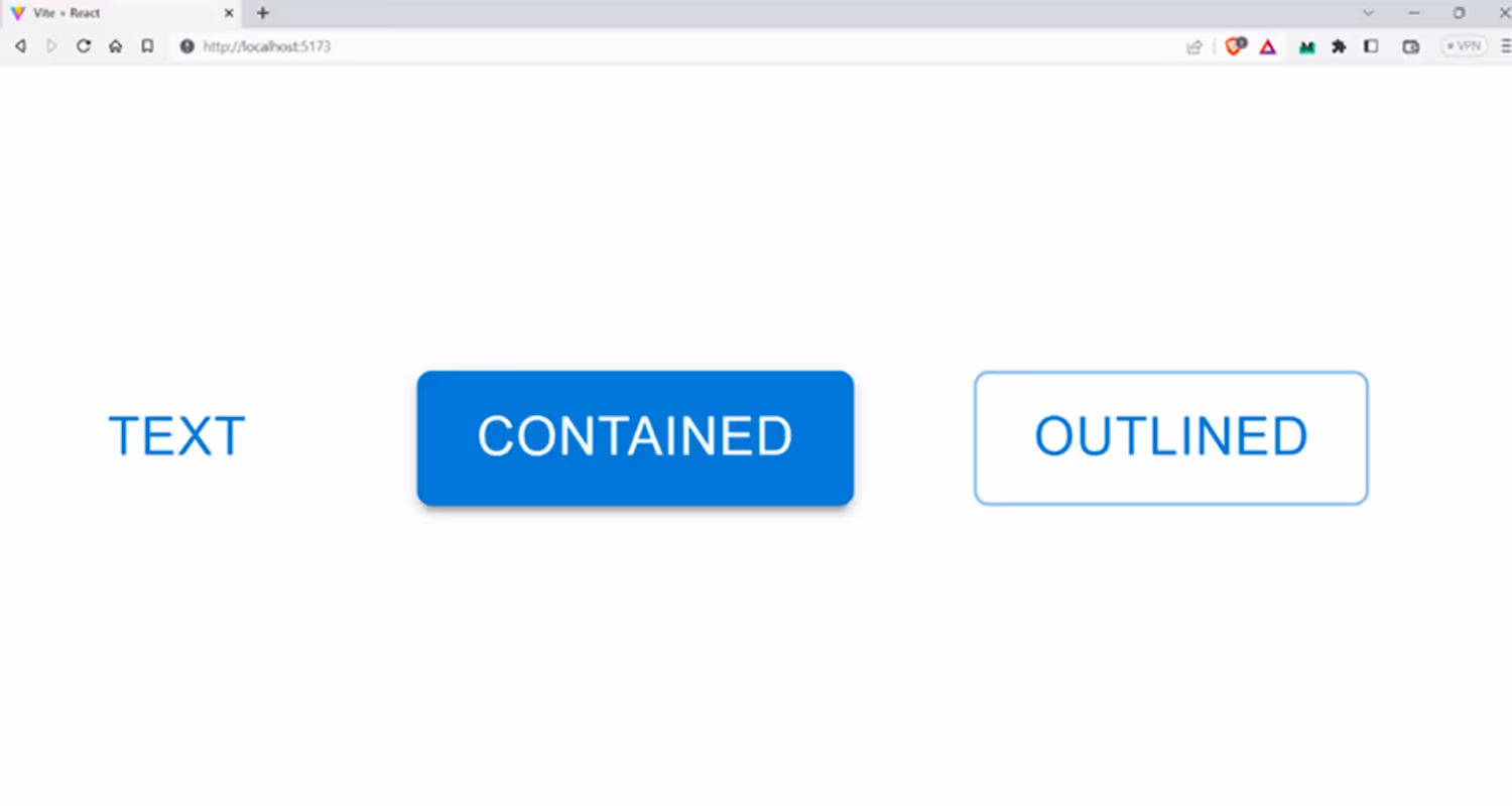
Most websites use buttons for CTAs, and Material UI provides a wide range of button components that can be used in different scenarios. A Button component can be used to respond to user clicks and show some animations.
Mainly, there are three variants for the Button component:
- Text button: Text buttons are commonly used for actions that are not as prominent, such as those found in dialogs and cards.
- Contained button: Contained buttons are highly emphasized and can be distinguished by their use of elevation and fill
- Outlined button: These are medium-emphasis buttons. They include actions that are important but aren't the main focus of an app.
Let’s look at an example of using the Button component to render three buttons with different variants (text, contained, and outlined).
Output:
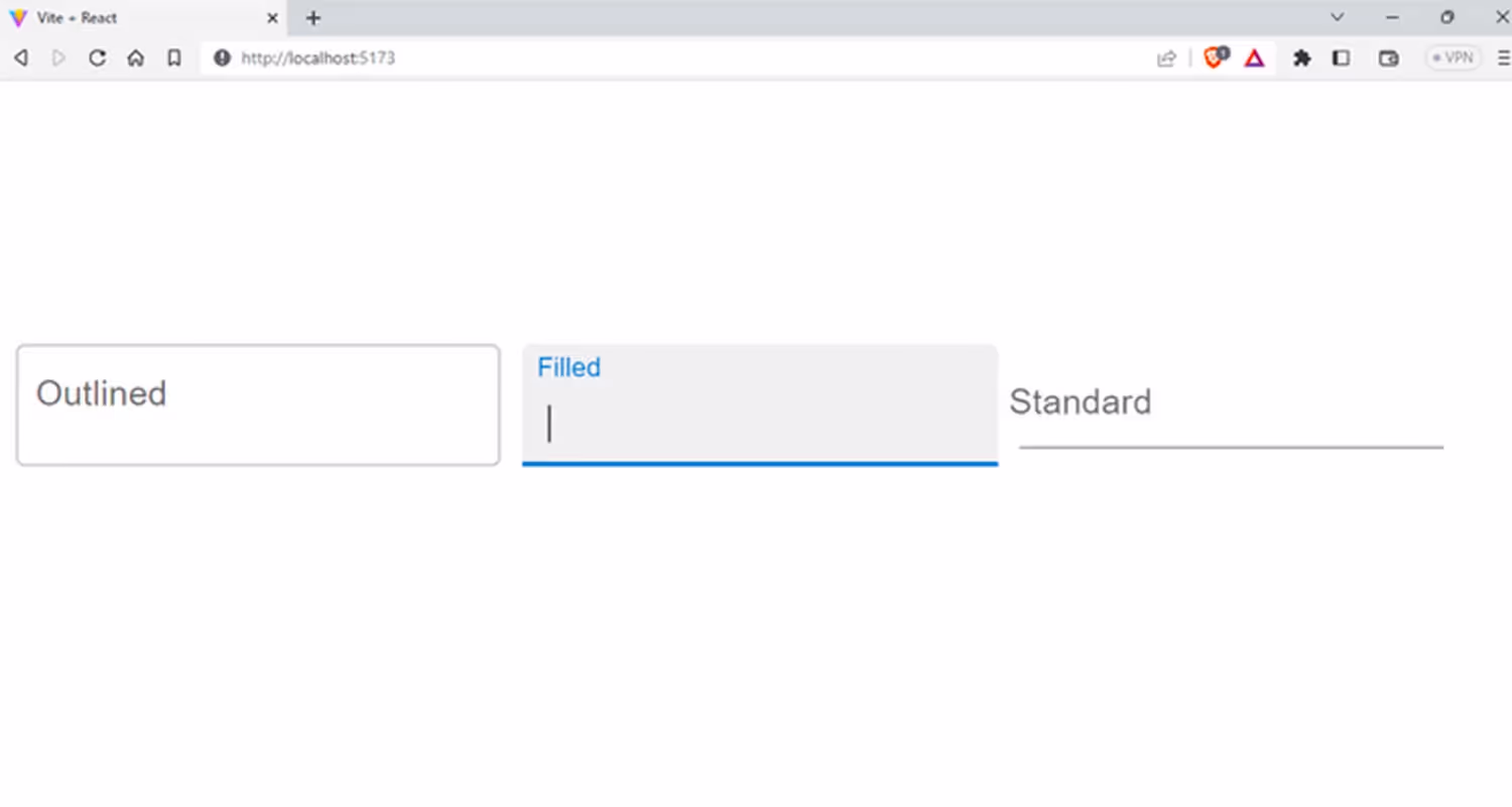
Text Fields
Text fields are used to take input directly from the user in a web application. Material UI provides a TextField component that can be used to create text fields. It is often used with form elements for handling user data.
TextField also has three variants: outlined, filled, and standard. This code is an example of the different variants of the Material UI TextField component.
Filename: App.jsx
Output:
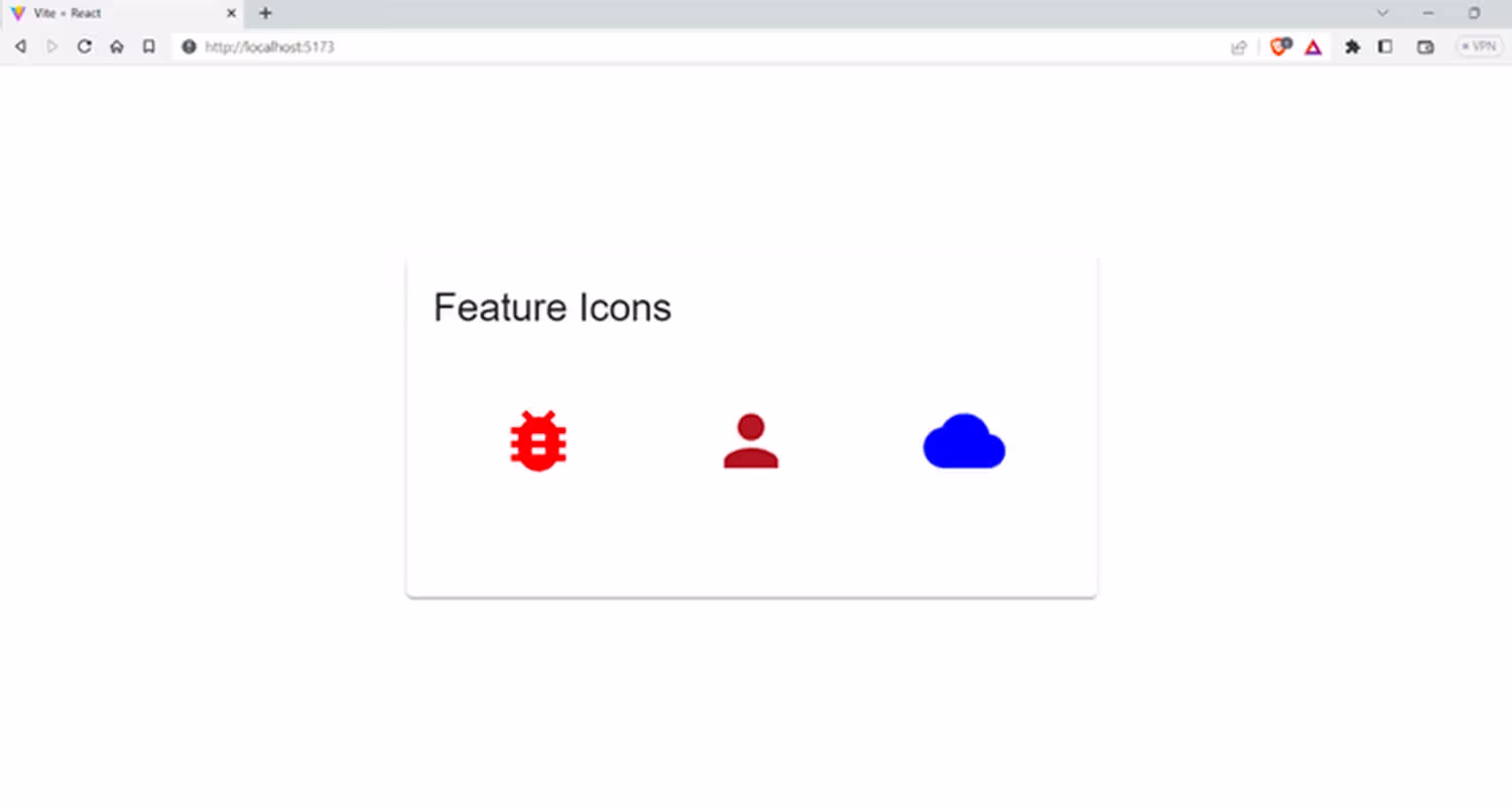
Icons
Material UI offers three distinct methods for incorporating icons into your project:
- Standardized material icons: These icons come pre-packaged as React components in SVG format.
- SvgIcon component: With these icons you can use custom SVG icons while still using React's features.
- Icon component: The icon component allows you to use custom font icons within your project, again wrapped in React to ensure optimal performance.
Using standardized material icons
To use standardized Material Icons, you need to additionally install the @mui/icons-material package using the package manager you prefer.
This code example demonstrates how to use three Material UI icons such as CloudIcon, PersonIcon, and BugReportIcon. We will update the default color and render them on the screen.
Output:
Using custom SVG Icons
Sometimes you may need custom icons that may not be readily available in Material UI icons. To our aid, we can use the SvgIcon wrapper available in Material UI to create custom icons.
MUI offers built-in accessibility for the SVG icons, and it can be easily used with other MUI components. SVG elements should be scaled so that they fit in a 24x24px viewport, and the viewBox attribute can be changed to fit your needs. The icon's default colour is inherited, but you can set a specific theme colour using the color prop.
Syntax:
Using Icon component
The Icon component allows you to have vector icons for your application. It acts like a wrapper for any icon font that supports ligatures, meaning you can use it with various fonts, including the popular Material Icons font. Before using the Icon component, you need to include an icon font in your project, such as the Material Icons font.
The following example shows how to use Font Awesome with Material UI. For this, you first install its package @fortawesome/react-fontawesome using npm or yarn, whichever one you prefer.
Output:

Cards
Cards are one of the most commonly used UI elements that you can use to display information with a boundary. They are self-contained boxes with specific information, such as text, and images. You can see cards being used on the pricing page, in blog previews, when featuring a product, etc.
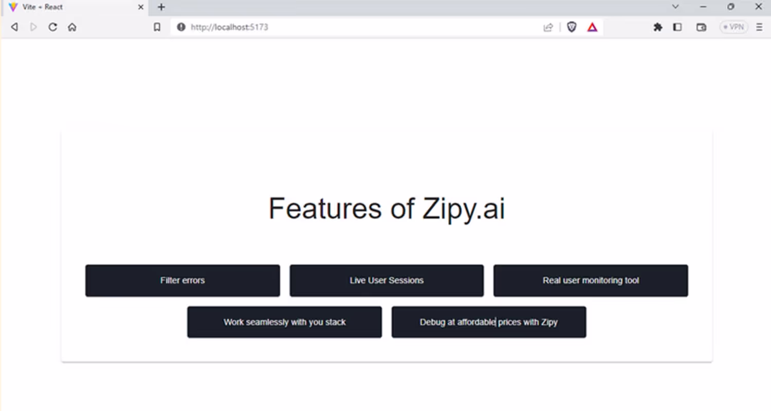
Here is an example of working with the Card component to feature a product. We use the CardMedia component to render an image here inside the card.
Output:

Typography
The Typography component allows developers to effectively display text in various styles, sizes, and weights. It helps create a visual hierarchy and communicates essential information to the user, and search engine.
The common typography heading types are:
- h1: Used as page title. It should only be used once in a page.
- h2: Used in section headings within the page.
- h3: Used in sub-section headings within a section.
- h4: Use in minor headings within a section or sub-section.
- h5: Used in minor headings or labels within a section or sub-section.
- h6: Use for captions or labels within a section or sub-section.
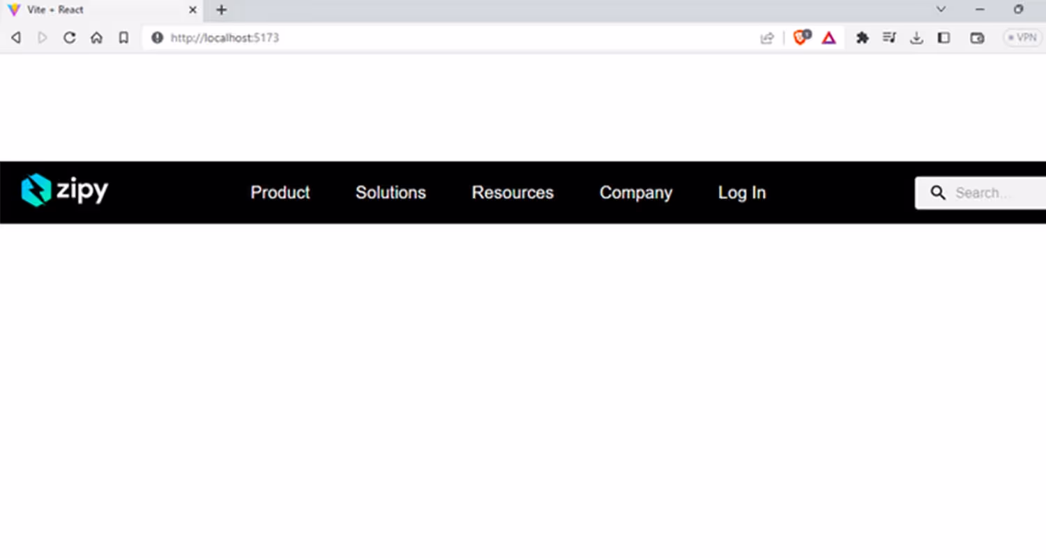
Appbar
AppBar is a core component in Material-UI that is used to create a top navigation bar for web applications. The top app bar displays content and actions that are relevant to the current screen. It's used for branding, screen titles, navigation, and actions.
I'm sharing a piece of code, to demonstrate the use of Material UI's styled components to create a custom AppBar component that includes a logo, links, and a search bar. The code uses useState to handle search input and styled components to set custom styles for the AppBar, Toolbar, Logo, Search, SearchIcon, LinkItems, and InputBase components.
Output:
Forms in Material UI
Material UI provides easy-to-use and visually appealing form components. We can customize the size, color, and styling of the form elements. Additionally, Material UI provides form-specific components, such as FormLabel, FormControl, and FormHelperText, to make forms more accessible and user-friendly.
Let’s now talk about some of the form elements and see how you can use them in your project.
TextField: As we mentioned earlier, the TextField component provides an input field that can be used for text, numbers, and passwords. It supports various types of input, such as email, phone number, and date, and comes with customization options.
Material UI also makes it easy to validate user input in forms and provide feedback for any errors. There are built-in validation functions that can be used with form elements like TextField. These validation functions include checking for required fields, valid email
addresses, numbers, and character limits. By using these functions, you can ensure that users enter valid input and provide clear feedback when errors occur.
Syntax
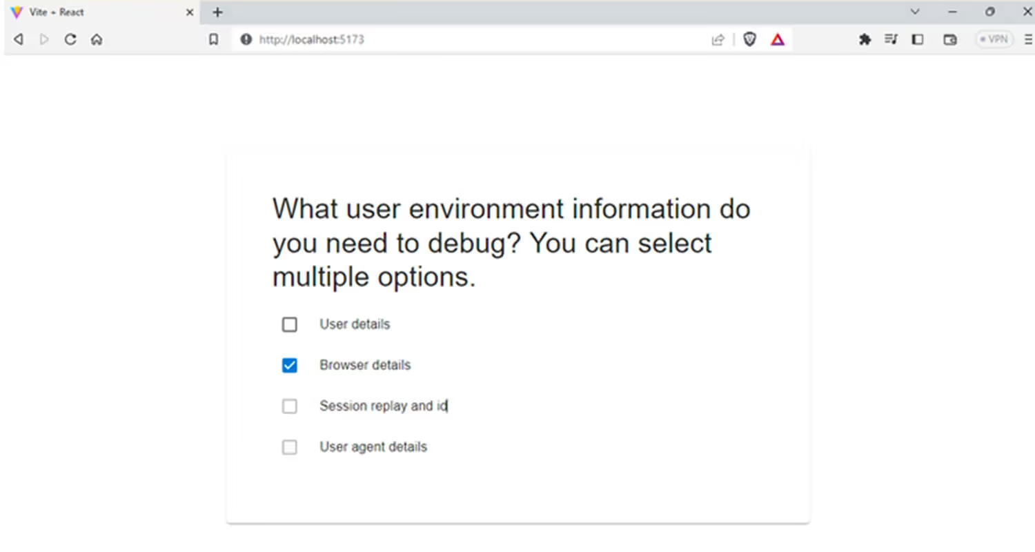
Checkbox: Checkboxes are a common UI element in forms and are mostly used when we want the user to select multiple options or toggle on or off a single option.
Syntax
The following code will help you create checkboxes in your forms.
Output:
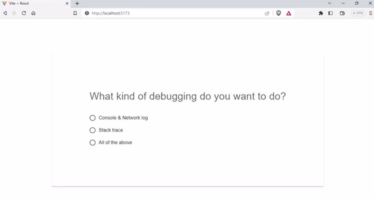
RadioGroup: This component provides a group of radio buttons that allow users to select one option from a set of mutually exclusive choices.
Syntax
The following code demonstrates how to use Material UI’s Radio and RadioGroup components. Each radio button is wrapped in a FormControlLabel component that provides the label for the radio button.
Output:
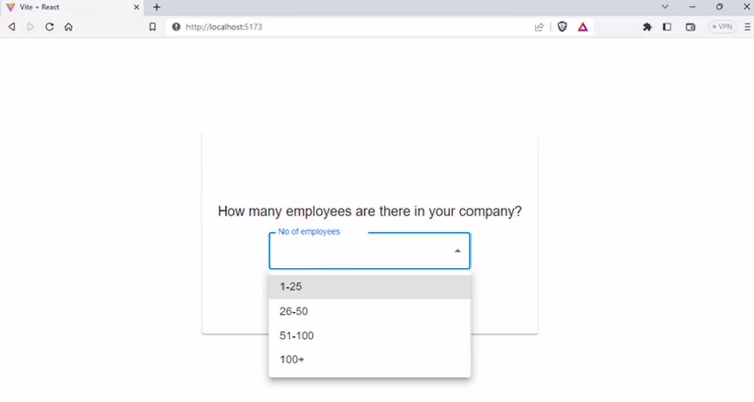
Select: The Select component in MUI allows you to have one or more options selected from a drop-down list. It supports various customization options such as search, filtering, and grouping.
Syntax
The following code demonstrates how to use Material UI's Select and MenuItem components to create a dropdown list.
Output:
Switch: The Switch component provides a simple yes or no type of selection option, allowing users to toggle between two states like on/off or true/false.
The following code demonstrates the implementation of Material UI's Switch component. Here we created a set of four switches from which the user can toggle between one or more options.
Output:

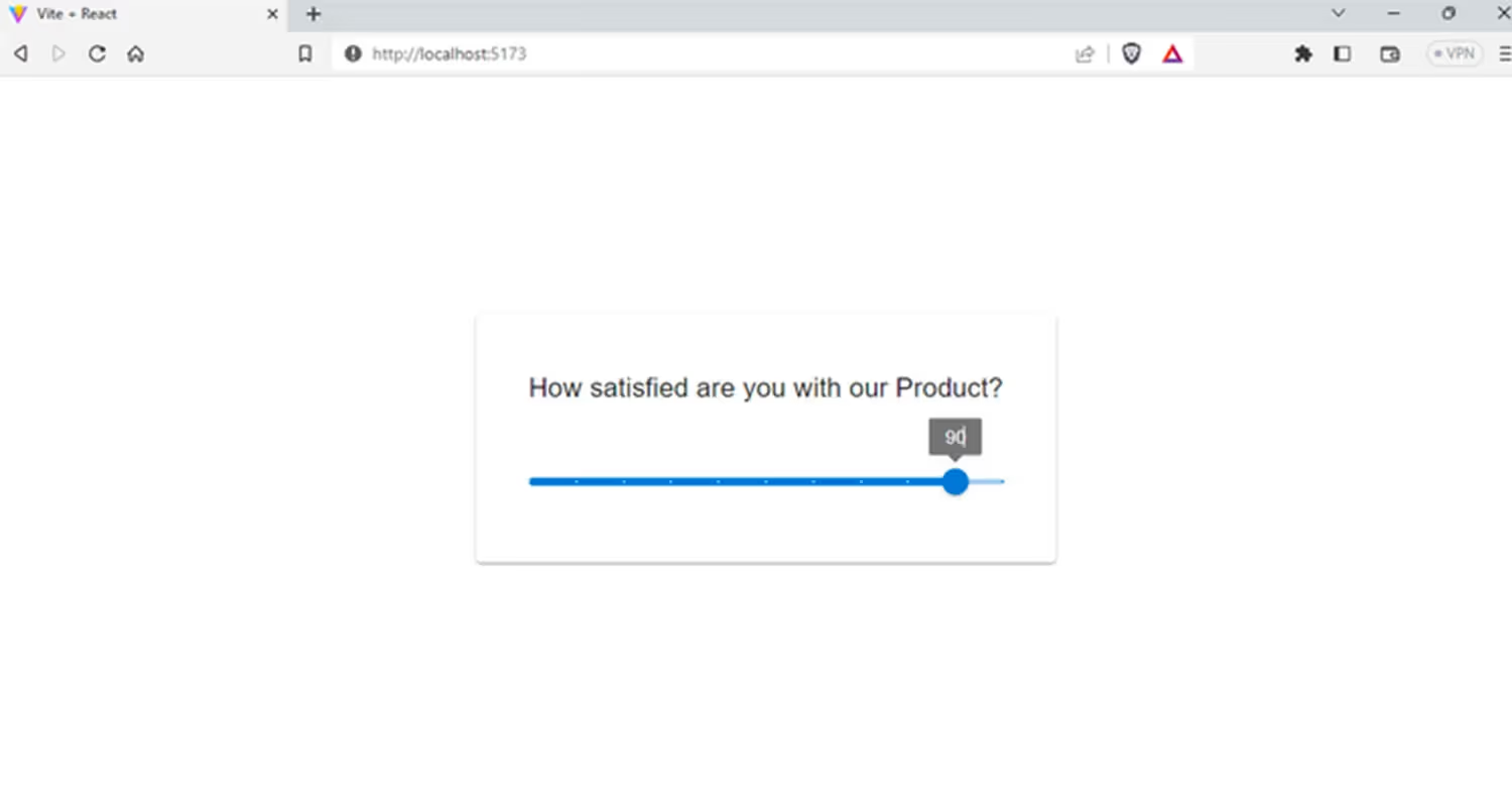
Slider: This Slider component provides a slider that allows users to drag and select a value from a range. It is a horizontal bar with a thumb or marker that users can drag along the bar to select a value.
This following code demonstrates how to use Material UI's Slider component to create a slider with customizable values.
Output:
You can create full fledged responsive forms with Material UI that can be used in your web application. The forms and their components, such as inputs, selects, checkboxes, and radio buttons, can automatically adjust their sizes and layouts based on the available screen space.
Layouts in Material UI
One of the notable features of Material UI is its powerful layout system. It allows us to easily create responsive and adaptable layouts that look clean on any viewport. In this section, we will look at all the aspects of layouts using Material UI.
Grid system for creating responsive layouts
Grid systems are fundamental components of layout systems, and Material UI's grid system is no exception. Developers can easily create responsive layouts that adjust to different screen sizes using Material UI's 12-column grid system.
The grid is based on the Flexbox layout, which allows for flexible and dynamic content placement. To make a layout responsive, you can define how many columns each grid item should span at different screen sizes using the xs, sm, md, lg, and xl props.
You'll need to import the Grid component from Material UI to use the grid system. The following example shows how to create a basic grid layout in Material UI.
File name: Basicgrid.jsx
Output:
Container component in Material UI
The Container component offered by Material UI serves as a versatile tool for wrapping and centering content, making it ideal for designing responsive layouts that accommodate various screen sizes.
The Container component in Material UI provides two types of styling and adjustment properties:
Fixed: If you prefer designing for a fixed set of sizes instead of accommodating a fully fluid viewport, you can use the Fixed property. With this property, the max-width matches the min-width of the current breakpoint.
The following code snippet shows how to use the fluid prop inside the container component:
Here are the sample values for the maxWidth values of the Material UI Container component with the fixed prop:
- sm (600-899px): The maxWidth will be 600px
- md (900-1279px): The maxWidth will be 900px
- lg (1200-1536px): The maxWidth will be 1200px
- xl (1536px and above): The maxWidth will be 1536px
Fluid: The Fluid component functions as a container that envelops its content with a maxWidth value specified as a prop. This value serves as the default width of the container and determines the targeted screen width.
Using the Fluid component in your Material UI design allows for a more flexible layout that can adapt to different screen sizes and devices.
By utilizing the Fluid component and setting the appropriate maxWidth value, you can ensure that your content is displayed optimally across various devices and screen sizes.
Syntax
Box component for adding spacing and borders
Material UI provides a Box component that you can use to add spacing and borders to your elements. The Box component is a versatile and adaptable component that allows you to easily customise your elements' spacing and borders.
The Box component acts as a wrapper component for the majority of the CSS utility requirements. You can think of it as a <div> wrapper around your code.
The following code demonstrates how to use Material UI's Box component to create a section and you can notice in the code that we have done a good amount of styling to Box component.
Output:

Material UI Theming
Material UI is a developer friendly framework, as we can easily customize MUI with our own theme. Material UI theme is essentially a collection of settings that define the look and feel of your app’s components. Some of the key theme properties include:
- Palette: Palette is the colors that are used throughout the app. The MUI palette also includes a variety of color types, such as primary, secondary, and error, each with their own shades.
- Typography: Typography includes the font families, sizes, and weights which allows you to have consistent typography styles to your UI components.
- Spacing: Spacing is used for consistent spacing between elements ensuring that the design looks visually balanced.
- Breakpoints: Breakpoints are used for responsive design settings. You can also override the existing breakpoints in Material-UI to define your own custom breakpoints that better suit the specific requirements of your application.
- Overrides: You can apply custom styles to specific components and this allows you to customize the appearance of Material UI components without modifying the default styles.
- Props: You can use default properties for Material UI components to configure their behavior and appearance without needing to define custom styles or override default styles. Some of the examples of props include color, variant, disabled etc.
Just like using CSS variables, you can create custom variables to the theme so you can use them everywhere.
In the following code, we will use the createTheme function in Material UI, to create a custom theme object for your application. Here, we added the status object to an error property that is assigned the value of red[500], just like this you can add your own custom rules.
Customizing Material UI components
Although Material UI provides almost all the components that we need, sometimes we need to customize it to match our design system. Material UI offers multiple options for customizing the styles of its components. The ideal approach for you will depend on the situation in hand. Some of the ways include:
1. One-off customization
You can adjust the styling for a single component instance, rather than applying changes to all instances of that component or creating a global theme. You can achieve it by using 'sx' prop, class name overrides, or state classes.
For example, you can use the sx prop to change the background colour of the Button component, as shown below:
2. Reusable Component
Reusable component that can be utilized in multiple places within an application, rather than being limited to a single location or page. These components can be customized using the styled function, which allows for overriding the default styles for a specific component.
3. Global Theme Overrides
With Material UI, you can change the way your components look using the createTheme function. This function helps you make a new theme object that you can tweak to suit your website's design system. Once created, the theme can be passed to the 'ThemeProvider' component.
4. Global CSS Override
You can override the CSS rules of a Material UI component by using Global CSS overrider
In order to accomplish this you can pass the styles to the GlobalStyles component which will do the rest for you.
Advanced Material UI components
When you are using Material UI for building a basic React application, you can simply achieve that by using the basic UI component. But there may be times when you need to make the most out of Material UI. Now it's time to get familiar with some advanced MUI components.
Material UI seems like a simple component library, but it can help you build advanced UI components like dashboards, tables, etc. Most websites will have some kind of dynamic data and in order to render the data, we might need components like tabs, pagination, modals, drawers, etc. We will look into some of the most commonly used advanced components as well in the later section.
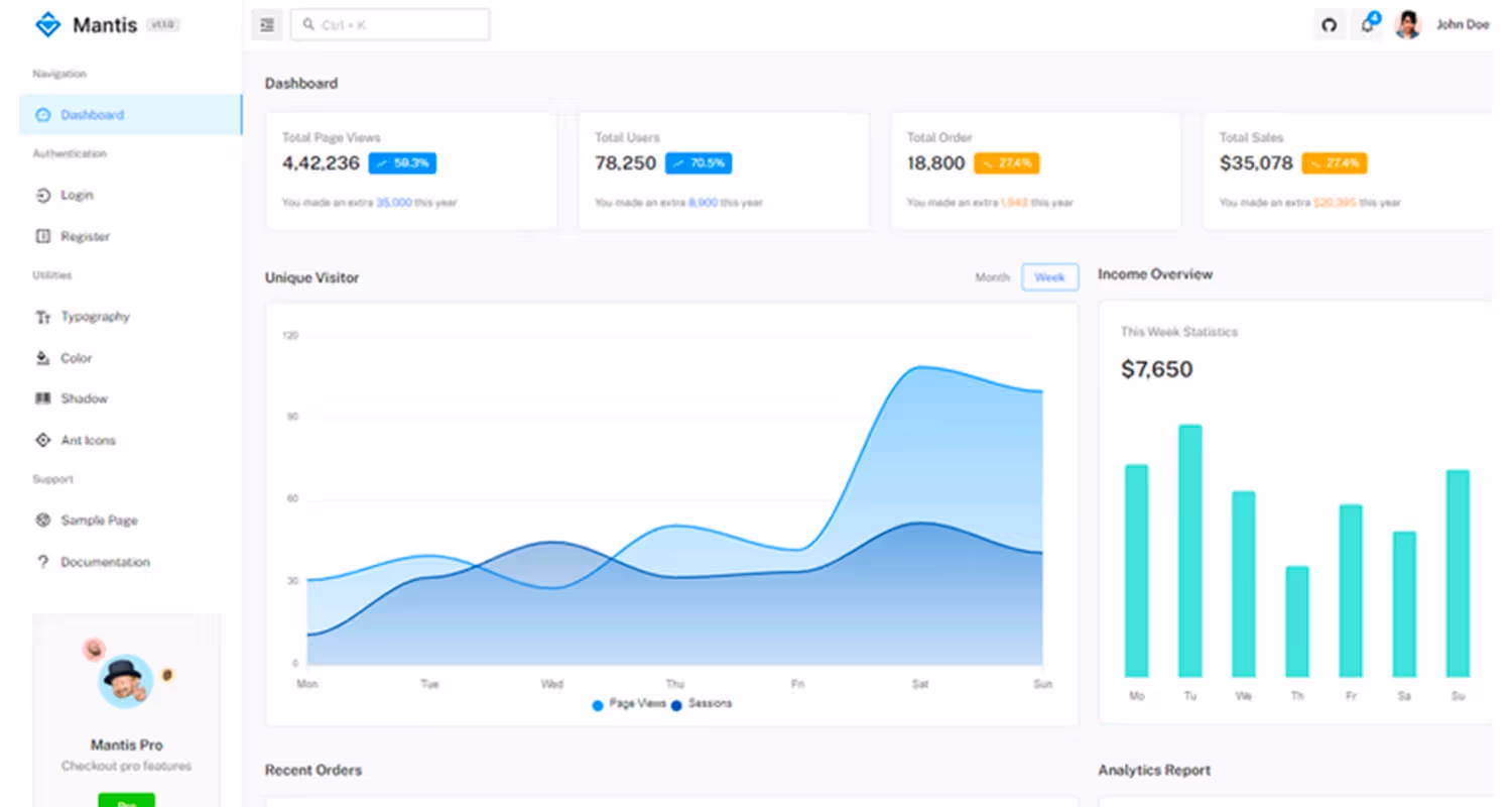
You can see from the above dashboard that we can create engaging user interfaces with the help of these UI components. Sometimes you may need to install some external libraries but for most of the time, Material UI got you covered.
Now let’s look at some of the advanced MUI components:
Modal
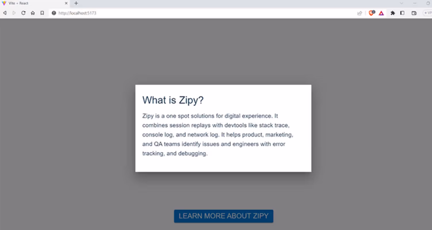
The Modal component in Material UI is like a foundation that you can build upon to create all kinds of modal windows. Whether you need a dialogue box, a popover, or a lightbox, the Modal component has got you covered.
The following code demonstrates how to create a basic modal using the Modal component in Material UI. Clicking the button opens the modal, which is handled by the handleonOpen function.
Output:
Table
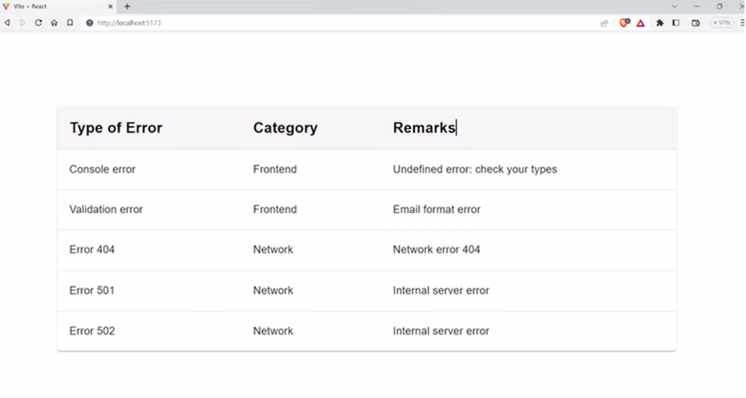
Material UI provides several table related elements to display tabular data and they can be fully customize. It’s commonly used to show the pricing table, and analytics dashboards..
You can refer to this code to create a table. For now, we have taken an example of error information that a debugging tool can capture. Our table shows categories and remarks for different types of errors.
Output:
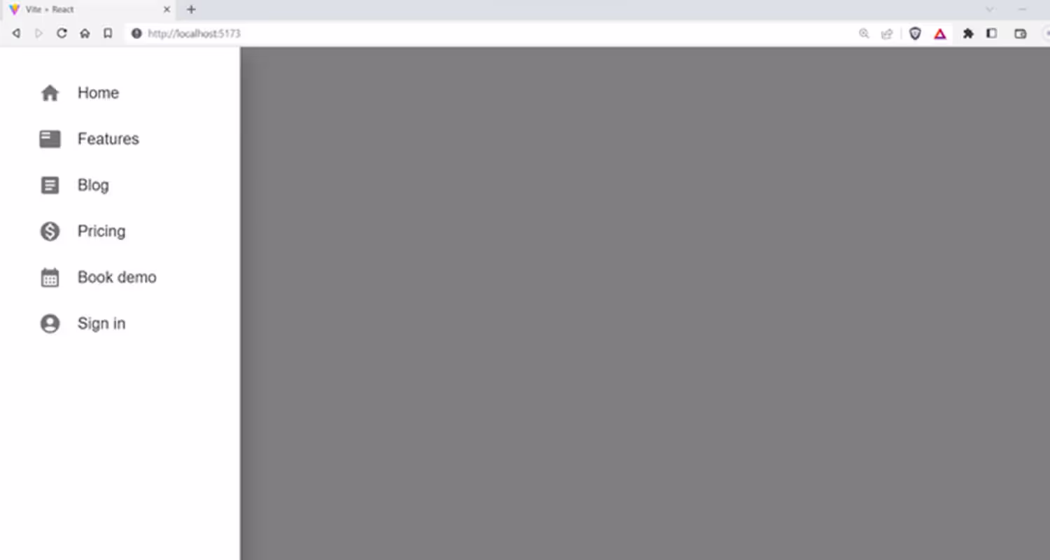
Drawer
Navigation Drawers are a user interface component commonly used in both web and mobile applications. They provide users access to different app pages by displaying a list of links or buttons.
The following code creates a Material-UI drawer that is left aligned. Clicking the hamburger menu opens a drawer with a list of items rendered using MUI components. It is often used in mobile devices to create a responsive layout.
Output:
On mobile devices, the drawer will look like this:
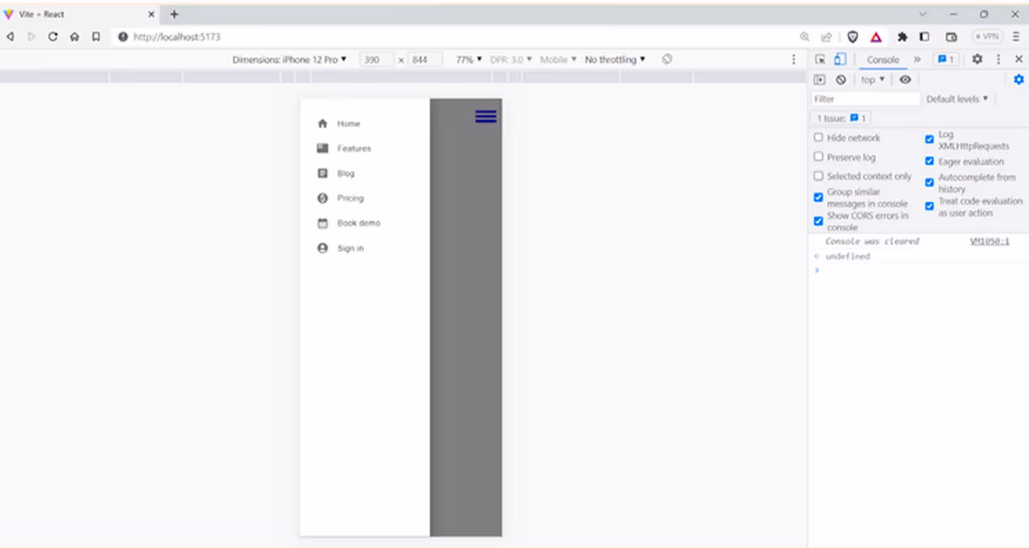
Image List
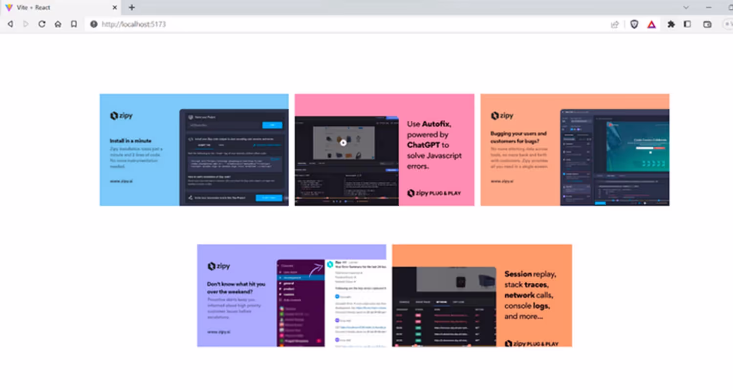
The Image List component allows you to display a collection of images in an organised grid.
The following code displays an image list using Material-UI's ImageList and ImageListItem components. The images are rendered from an array of data containing URLs and titles for each image.
Output:
Wrapping it Up
Congratulations on reaching this far! You are a fantastic reader!
We know that user experience is the deal breaker in the current market, creating a demand for beautiful and functional products. Material UI with its powerful and modern framework can be a lifesaver. So try it out and craft visually appealing, user-friendly, and responsive applications faster.
Material-UI, licensed under MIT, allows freedom to use, modify, and distribute without sharing source code or modifications. In today's market, user experience is crucial, and Material UI's modern framework helps create visually appealing, user-friendly, and responsive applications quickly. Give it a try!
Happy Materializing!


.webp)
.svg)