.svg)


Typography is a critical aspect of any design project, and Material-UI React provides a powerful and flexible way to incorporate typography into your applications. Our purpose today is to explore the essentials of utilizing typography in Material-UI React and how to customize typography effectively for your project.
What is typography?
Typography refers to the arrangement, style and overall look of printed matter. In website design practices, typography is critical because it maintains uniformity across all pages on a site. Moreover, incorporating appropriate typographical elements enhances the reader’s experience with well-presented materials that are easy to read & use. Typography includes everything from font choice and size to spacing and line height.
Why typography matters for design?
The visual impact of any composition largely depends on typography, much like it does on the six principles of design. Typography influences the overall visual composition and aesthetics of a design, creating exceptional designs by expressing unique ideas that resonate with viewers' emotions. Here are several reasons why typography is important:
- Communication: Typography acts as a visual language, allowing designers to effectively convey messages and information. Enhancing readability ensures that the intended message is clearly communicated to the audience.
- Visual Hierarchy: Just as the principles of design establish a visual hierarchy, typography helps structure the content within a design. By adjusting font size, weight, and style, designers can guide the viewer's attention and create a sense of order.
- Brand Identity: Typography plays a significant role in defining and reinforcing a brand's identity. Consistent use of specific typefaces and typographic styles across various design materials helps establish a recognizable and cohesive brand image.
- Aesthetics and Visual Appeal: Typography significantly enhances the visual appeal of a design. Thoughtful font choices can evoke certain feelings, create nostalgia, or give a sense of modernity.
- Differentiation: In a crowded design landscape, typography helps designs stand out. By using unique or custom typefaces, designers can create a distinct visual identity that sets their work apart.
- Accessibility: Good typography improves accessibility by ensuring that content is easily readable for everyone, including those with visual impairments or reading difficulties.
Good vs Bad typography in UI design
Here is the distinction between the different elements of typography based upon good and bad factors.
Getting started with material UI typography
Material-UI React provides a typography component that allows you to easily incorporate typography into your applications. It provides you with the freedom to select and modify various typographic elements to achieve the desired look and feel. This is the reason why it is termed to be flexible and customizable to fit your project's needs.
Follow the below steps to create a basic typography app in your editor.
Step 1: Create a React app named as ‘zipytypography’.
Step 2: Switch your directory to the file you just create above
Step 3: After you have changed the directory, open App.js file in your editor. To use typography in Material-UI React, import the modules from the Material-UI/core package in App.js.
Step 4: Once you have imported typography, you can use it in your React components. Now, let us understand typography variants.
Typography variants refer to the different styles or variations of a typeface available within a font family. Here are some common typography variants:
- Weight Variants: Typefaces often come in various weights, such as light, regular, medium, bold, and extra bold. These weight variants allow designers to emphasize different elements of the text and create a visual hierarchy within the design.
- Width Variants: Some typefaces offer different width options, such as condensed or extended variants. These variants let designers adjust the horizontal space occupied by the text, enabling them to fit more or less content within a given area.
- Style Variants: Style variants include different variations of a typeface with distinct characteristics, such as italics, oblique, or decorative versions. These variants can add emphasis, provide contrast, or convey a specific aesthetic tone within the design.
- Small Caps: Many typefaces offer small capital letter variants, which are smaller versions of uppercase letters. Small caps are often used for stylistic purposes or to enhance typographic consistency within a design.
- Numerals: Some typefaces provide different numeral styles, such as proportional figures (varying widths) or tabular figures (uniform widths). These numeral variants are useful in different contexts, such as aligning numbers in tables or maintaining consistent spacing within text.
- Ligatures: Ligatures are special characters that combine two or more individual characters into a single typographic form. They are designed to improve the appearance and readability of certain letter combinations.
We have covered most of the typography variants in our app using the variant prop to specify its type. Now, we have completed all the steps regarding installation of different packages needed. So now, let’s look at the theming part a bit.
Customizing Material UI typography
While Material-UI React provides several predefined variants for typography, you may want to customize the typography to fit your project's specific needs. Material-UI React provides several ways to customize typography, including using custom fonts and modifying the typography theme.
What are custom fonts?
Custom fonts are web fonts that allow designers to go beyond the limited set of default system fonts. They can choose unique typefaces that align with their branding, enhance the visual aesthetics, and create a distinctive look and feel for their web content.
When are custom fonts needed?
Custom fonts are needed in various situations where designers want to achieve specific design goals like consistency, visual appeal, readability and maintain branding.
Using custom fonts
To use custom fonts in Material UI for your React app, you need to import the font files and create a new typography theme with the custom fonts. Here's an example of how to use a custom font in Material-UI React. The font families included here are just to specify the fonts which can be used to style the variant. You need to just pick one at the time of coding.
This code defines a custom style using the makeStyles function from the Material UI library. The style is applied to the typography component and sets its font family to a combination of multiple font families separated by commas.
The join method is used to concatenate these font families into a single string, which is then passed as a value to the fontFamily property. Our program's design makes certain that even if specific fonts are not on a user's computer, there are backup font choices available. This approach ensures seamless performance and eliminates potential problems.
Typography theme
This theme refers to a set of typographic rules, guidelines, and visual styles that are applied consistently throughout a design project or across a website. With the help of this, you can govern the selection, organization of typefaces, fonts, spacing, sizes, and other typographic elements.
Modifying typography theme
You can also modify the typography theme to customize the typography in Material-UI React. Typography theme allows you to configure fontFamily, fontWeight, fontSize, etc.
Here's an example of how to modify the typography theme in Material-UI React:
In the above code, we have just modified the h1 variant. We have assigned various typographic elements to h1 variant. The fontFamily used is Roboto among the ones which we have suggested above, then fontWeight, fontSize, lineHeight can also be chosen from your own preference. You can also modify other variants in the theme to use it in your program.
Implementing all the stylings using <Typography /> in App.js file
- This code imports several components from the Material-UI library, including makeStyles, and Typography.
- It defines a custom style using the makeStyles function and sets the fontFamily property of the Typography component to a combination of font families that include Roboto, sans-serif, Apple Color Emoji, Segoe UI Emoji, and Segoe UI Symbol.
- The App function renders the return function with several Typography components inside it.
- Each Typography component has a different variant specified, ranging from h1 to overline, which controls the size and weight of the text.
- Some Typography components also have additional properties specified, such as align, color, display, and gutterBottom, which control various aspects of the text's presentation.
- One Typography component has a custom class specified using the classes object returned by the useStyles hook, which allows for further customization of its styling.
- The text displayed in the Typography components promotes a product called Zipy that helps developers in fixing bugs faster.
- The last line of the code exports the App component as the default export.
- To activate and utilize the application, use the following command from the root directory of the project. You can use this command below:
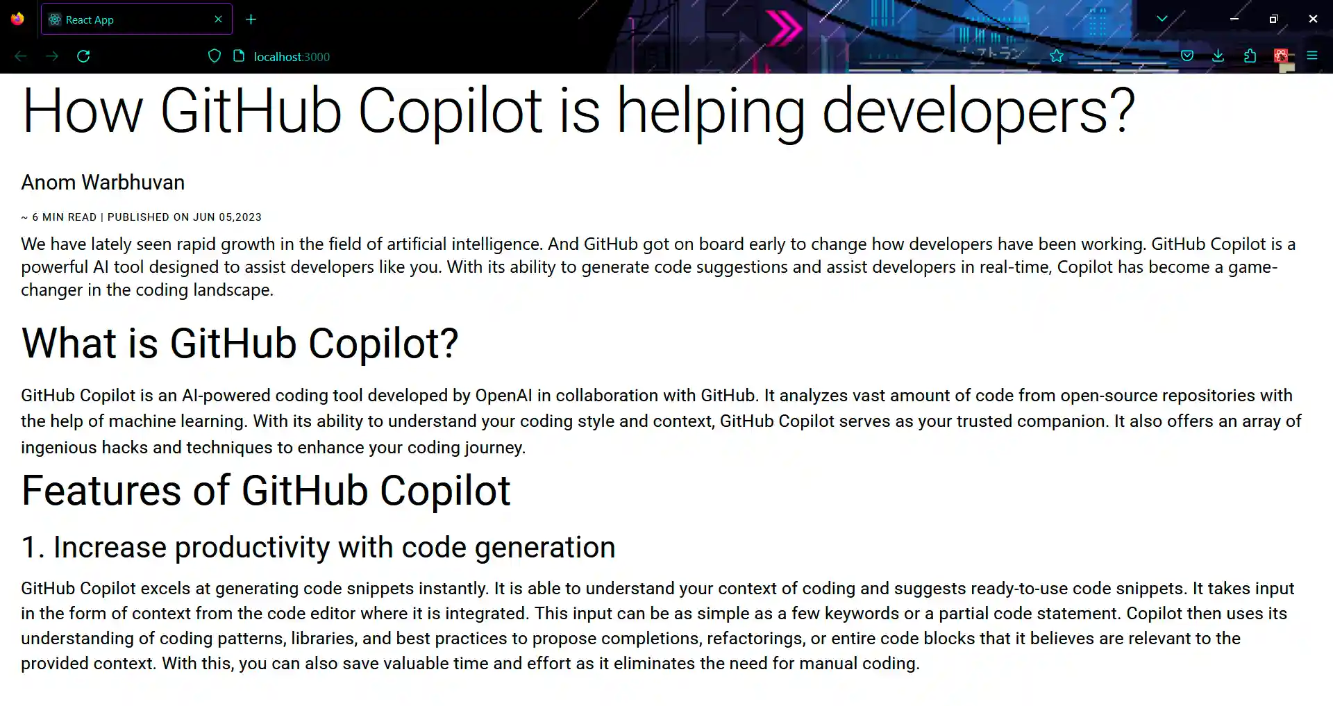
Running app
You can check the result below for the placing of different variants including their spacing, alignment, font-size, font-family and more. It showcases all the variants which we used in App.js following typographic theme system.
Best Practices
When using Material-UI typography for React, there are several steps you can follow to ensure a consistent and visually appealing design. Here are some best practices:
- Use the Typography Component: The Material-UI Typography component serves as a foundation for consistent and accessible typography across your application. You can choose styles and variants for various text categories, such as headings, paragraphs, or buttons.
- Establish a Typographic Hierarchy: Define a clear hierarchy for your typography to help users understand the content structure. The Material-UI Typography component offers variants like h1, h2, h3, subtitle1, and body1, which you can use to establish a hierarchy.
- Ensure Readability: Choose fonts, font sizes, and line heights that enhance readability. Ensure there is enough contrast between the text and background colors. Avoid small font sizes, overly decorative fonts, or low contrast combinations that make the text hard to read.
- Customize Typography Styles: If you need to deviate from the default typography styles provided by Material-UI, you can customize them using the
MuiTypographyrule in the theme. This allows you to override various style properties like font family, size, weight, and color.
These are a few practices considered for creating visually pleasing and accessible typography in Material UI.
Empower web accessibility with Material UI typography components
nsuring that websites are accessible is essential for making digital experiences inclusive and usable for people with various disabilities, such as visual impairments. Material UI's Typography components come with built-in support for accessibility attributes like aria-label and aria-describedby.
These attributes help developers enhance the accessibility of typographic elements and provide additional information to assistive technologies. For individuals with visual impairments or other disabilities, proper typographic accessibility is crucial.
Material UI understands this importance and offers tools to enhance the accessibility of typographic content. Developers can refer to the official Material UI documentation to gain a thorough understanding of how to implement these accessibility attributes effectively. By using these components and accessibility attributes, developers can create typographic content that is inclusive and accessible to all users.
For more detailed implementation guidelines, I encourage referring to the official Material UI documentation, which provides valuable insights into creating accessible typography components.
Conclusion
So far, we have found that Material UI's Typography component provides an easy and intuitive approach to implementing typography in React applications. With just a few lines of code, you can organize text elements according to the desired typographic hierarchy and ensure consistent styling across your project.
But that's not all—Material UI React also offers theme customization options, allowing developers to leverage the power of typography while maintaining consistency and accessibility. For more details, check out our Material UI guide blog.
Happy coding!


.webp)
.svg)